Jessica Monteiro case 02
All work

Case 02 · Crypto payments · iOS app · 0 → 1

Paying with crypto, as easily as Pix

Crypex lets people in Brazil pay a Pix straight from their crypto balance, without selling, withdrawing and waiting first. I designed it from a blank file to a dev-ready handoff in about six weeks, as the only designer, side by side with the engineer who founded it.

UI/UXMobile AppFintech0 → 1
ClientIndependent founder, software engineer
RoleSole product designer, UX + UI
Timeline2024 · about 6 weeks
StatusDesign complete · launch on hold
Cover Crypex iOS · 390
Crypex

Cryptocurrencies as conventional payment methods

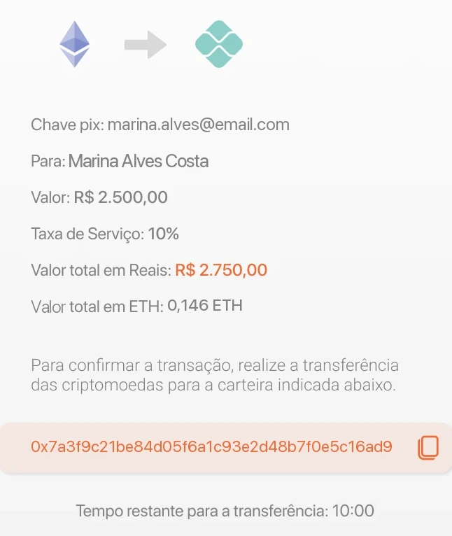
Pay screen: converting ETH into a Pix of R$ 2,500.00. Home screen: AI insights, services and the crypto market. Payment review with fee, totals and a ten-minute quote timer.
01

Overview

A crypto wallet that pays like a bank app

The founder, a software engineer, wanted to see a simple idea take shape: treat cryptocurrencies as a conventional payment method. Hold ETH, BTC or USDT, and use that balance to pay a Pix, the instant payment most Brazilians already use every day, without ever leaving the app.

There was no earlier version to fix. The brief was the product itself: the flows, the interface and a small set of components a developer could build from. All of the UX and UI in the file is mine, from the first drafts and the splash screen to the handoff, shaped in close, direct conversation with the founder.

02

The challenge

Crypto is easy to hold and hard to spend

Paying a bill with crypto usually means selling on an exchange, withdrawing to a bank account, waiting for the transfer and only then paying. Every hop adds a fee, a delay and one more chance to make a mistake with money that can't be pulled back.

How might we

make paying with crypto feel as ordinary, and as safe, as paying with Pix?

Constraints

  • A fixed brand colour

    Orange was the founder's colour and not up for debate. The system had to be built around it.

  • Prices that never sit still

    Crypto quotes move by the minute, so reais and crypto can drift apart in the middle of a payment.

  • No undo

    A transfer on the blockchain can't be reversed. Every step before confirming has to leave room to check.

  • Freelance pace

    About six weeks, one designer and one engineer. Every idea had to be cheap to test.

03

Process

Lean by design

A freelance timeline has no room for interviews and personas. So I leaned on what we did have: a founder who knew the domain, a developer who could put screens on localhost within days, and five people willing to try them.

  1. 1

    Frame

    Pin down the one job with the founder: pay a Pix using a crypto balance.

  2. 2

    Draft

    Sketch the pay flow screen by screen, then sign-in and home around it.

  3. 3

    Test

    Try the flows on a localhost build with 5 people: developers and people new to crypto.

  4. 4

    Refine

    Rebuild the pay flow around what worked, then add every state and error.

  5. 5

    Hand off

    Components and sections marked ready for dev, for the founder to build from.

The pay flow, mapped

Redrawn for this case study from the final screens.

  1. StartHomePay button in the tab bar
  2. Step 1AmountFrom ETH, to Pix, live rate
  3. Step 2RecipientPix key, then who's receiving
  4. Step 3ReviewFee, totals, 10:00 quote lock
  5. PaidSee payment history
    FailedCheck the details, try again
Home, then amount, recipient and review, ending in either a successful or a failed payment.

From six questions to one converter

First draft · 6 screens

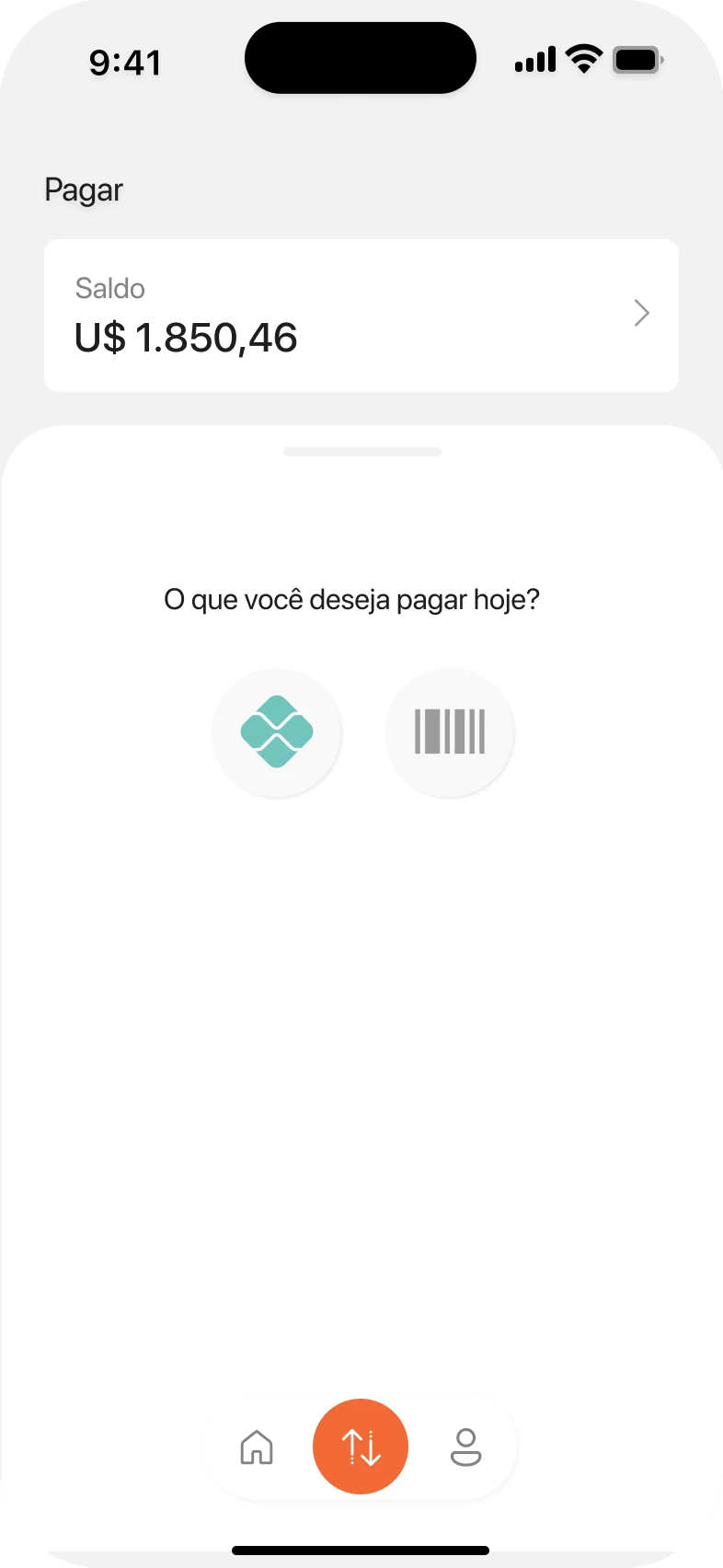
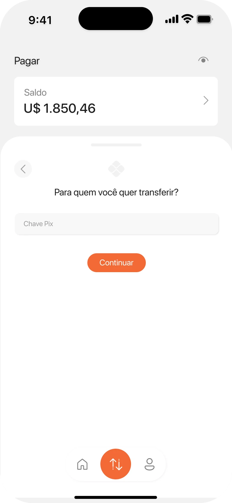
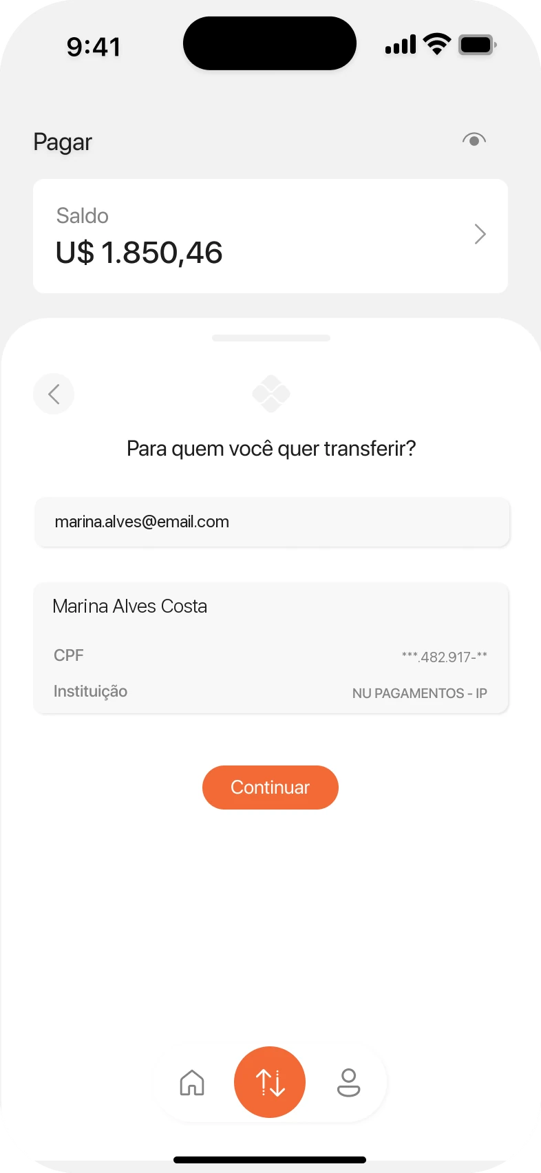
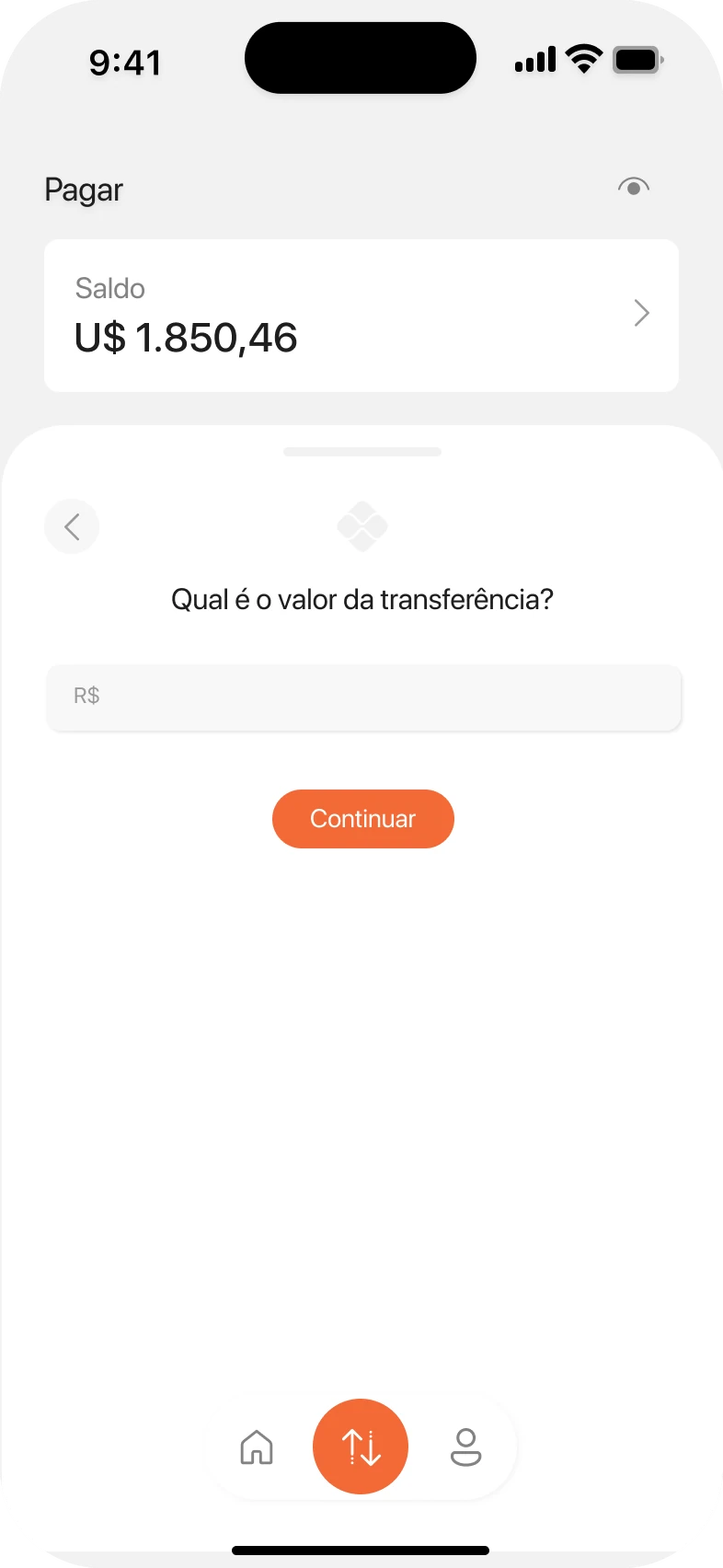
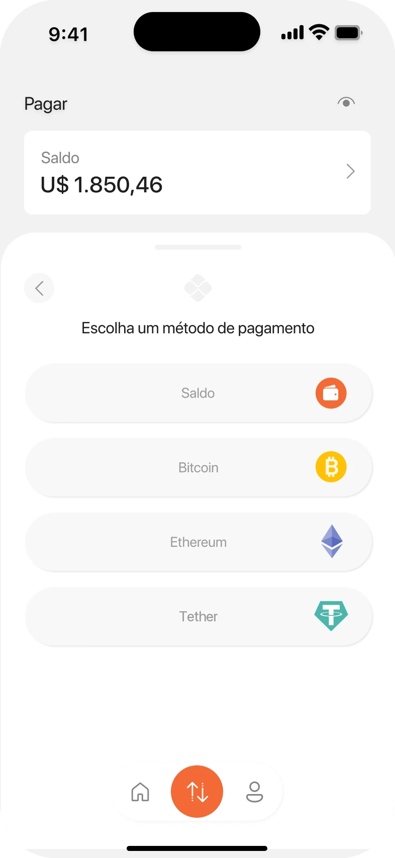
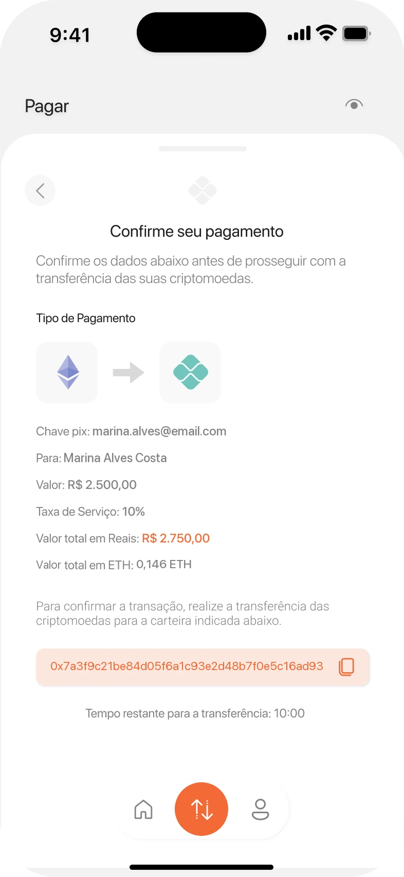
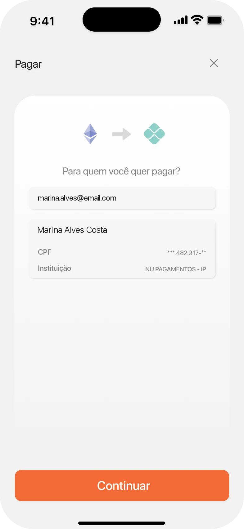
Draft 1: “What do you want to pay today?” with Pix and boleto options. Draft 2: “Who do you want to send to?” with a Pix key field. Draft 3: the recipient's name, CPF and bank shown for confirmation. Draft 4: “How much do you want to send?” with an amount in reais. Draft 5: choose how to pay, from balance, Bitcoin, Ethereum or Tether. Draft 6: payment confirmation with fee, totals and the wallet address.
One question per screen. Clear, but long, and the crypto amount only showed up on the very last screen.

Final · 3 steps

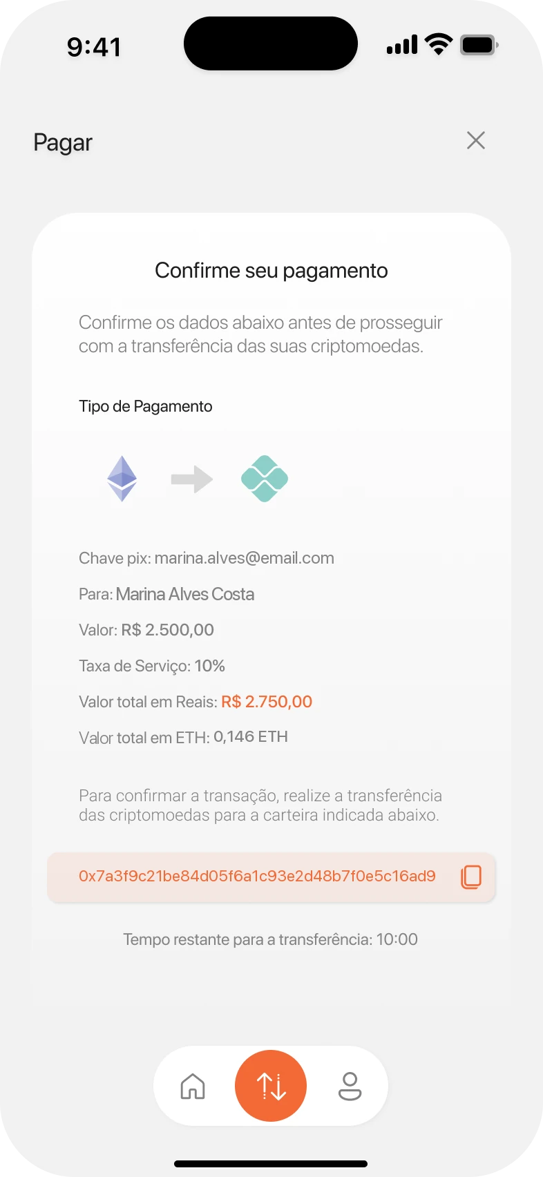
Final step 1: a converter with ETH on top, Pix below and a numeric keypad. Final step 2: Pix key entered and the recipient's details shown. Final step 3: review with fee, totals in reais and ETH, wallet address and timer.
Amount and currency on one screen, like an exchange. Both sides of the trade in view from the first tap.

The drafts asked for the amount in reais and only later for the currency to pay with, so people saw what they were really spending at the very end. Folding both into a single converter put the trade in plain sight and cut the path from six screens to three steps. On the localhost build, it was the version that worked best for both groups, developers and people new to crypto.

What the five sessions showed

Notes from the localhost build, and what each one changed.

  1. We saw

    People typed an amount in reais and only met the crypto side on the last screen. Some went back to change the value once they saw it in ETH.

    So I

    Put both sides of the trade on one screen, with the live rate right under them.

  2. We saw

    People new to crypto compared it with the Pix in their bank app, which they finish in seconds. Six screens felt like filling in a form, not paying.

    So I

    Merged six questions into three steps: amount, recipient, review.

  3. We saw

    With the phone keyboard open, the other currency and the rate slid out of view while people typed.

    So I

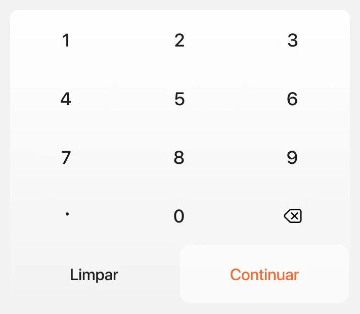
    Designed a built-in keypad that leaves both values and the rate on screen.

  4. We saw

    Before tapping continue, people looked for the recipient's name, the habit their bank app has taught them.

    So I

    Show name, masked CPF and bank as soon as the Pix key goes in, before anything is sent.

  5. We saw

    Developers asked what happens if the price moves while the transfer is pending. Everyone else asked about the fee.

    So I

    Locked the quote for ten minutes with a visible countdown, and listed the fee and both totals, reais and ETH, in plain view.

04

The solution

An app that feels like paying, not trading

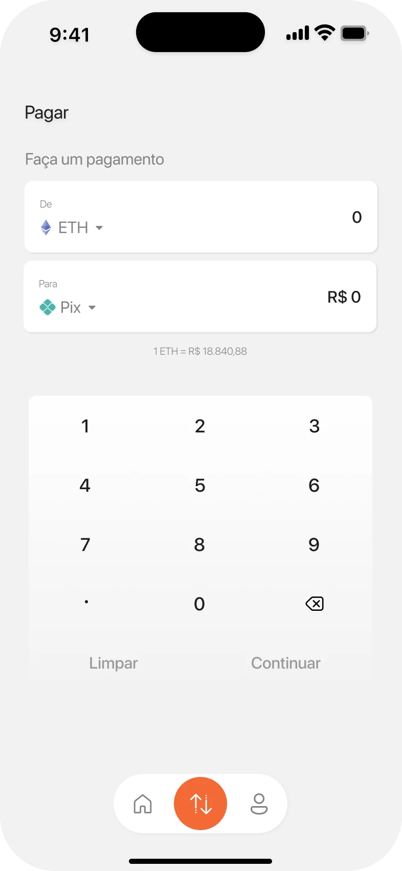
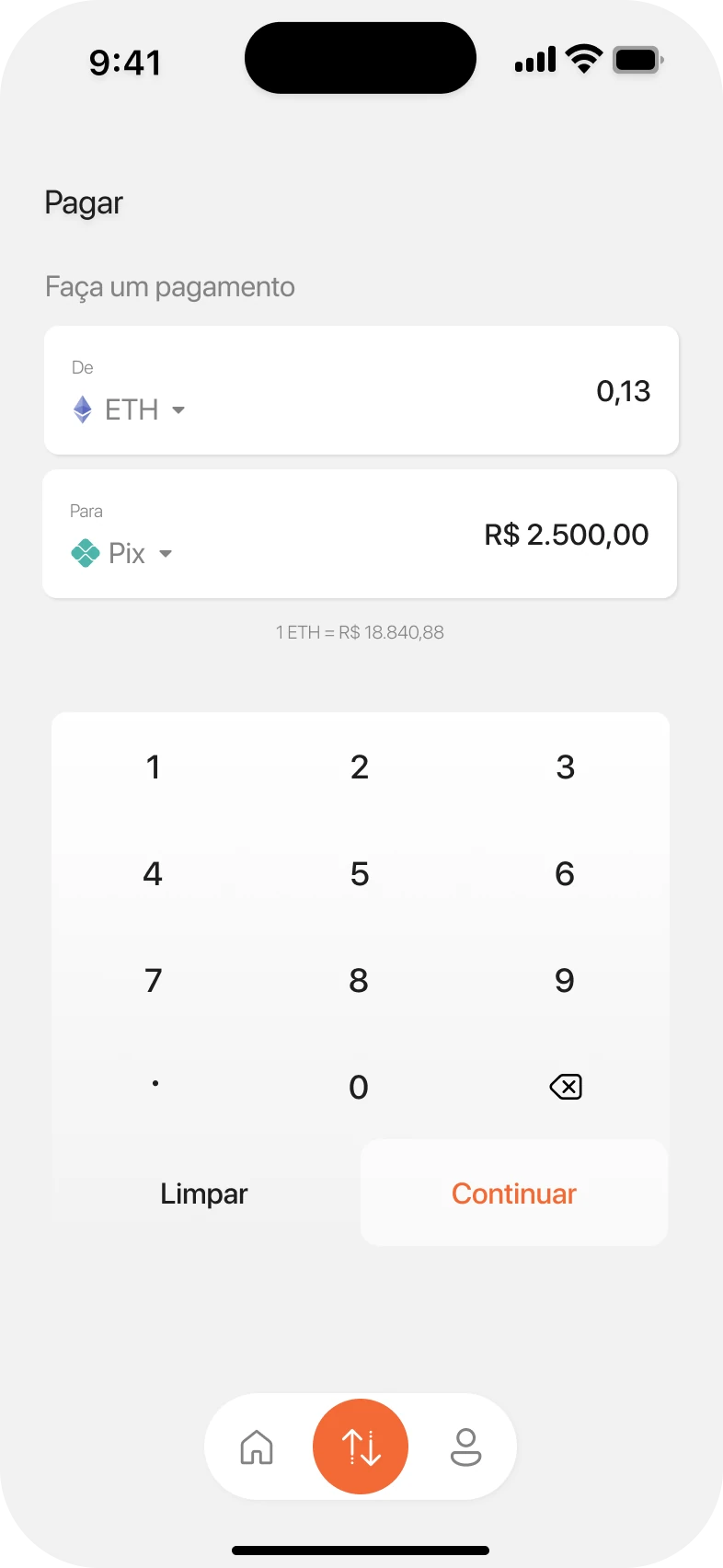
Pay screen before typing: ETH and Pix fields at zero and the Continue button disabled. Pay screen with an amount: ETH converted to R$ 2,500.00 and Continue enabled.

Pay · amount

One screen, both sides of the trade

  • “From ETH” on top, “To Pix” below: the same pattern people know from exchanges and currency apps.
  • The live rate sits right under the fields, so there's no maths to do.
  • A built-in keypad keeps both numbers visible while typing, with no system keyboard in the way.
  • Continue only wakes up once there's an amount to pay.
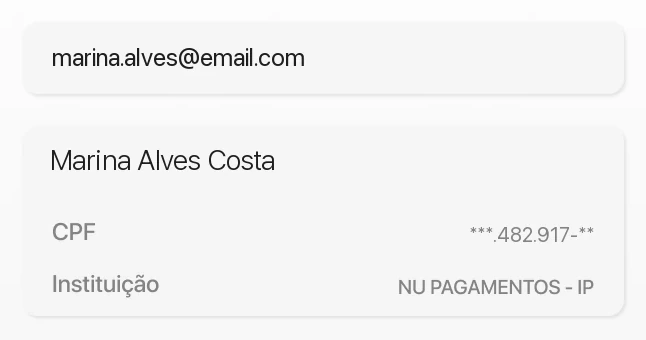
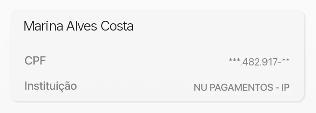
Close-up of the recipient step: the Pix key, then the recipient's name, masked CPF and bank. Close-up of the review: route from ETH to Pix, value, 10% fee, totals in reais and ETH, the wallet address with a copy button and the ten-minute countdown.

Pay · recipient and review

Every number in the open

  • Check before you send. As soon as the Pix key goes in, the app shows who is receiving, with a masked CPF and the bank. A typo shows up as the wrong name, not as lost money.
  • No hidden fee. The review lists the value, the 10% service fee and the total twice: in reais and in ETH.

  • A price that holds. Crypto moves by the minute, so the quote is locked for ten minutes. The countdown makes that window visible instead of surprising people with a new price.
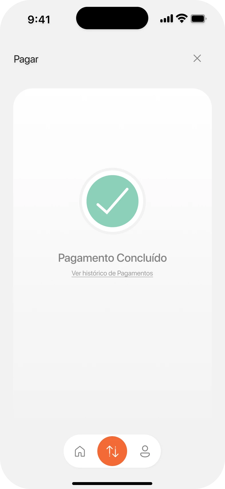
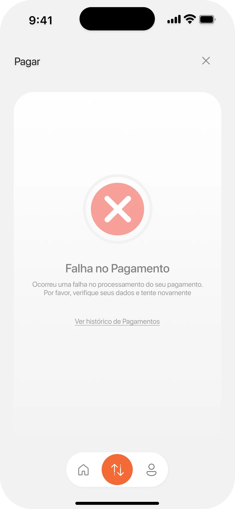
Success screen: a green check and “Payment complete”, with a link to payment history. Failure screen: a red cross and “Payment failed”, with an explanation and a link to payment history.

Pay · endings

Clear endings, good or bad

With money on the line, the last screen matters as much as the first. Success and failure share one calm layout: a single symbol, one sentence in plain words and one way forward, straight to the payment history.

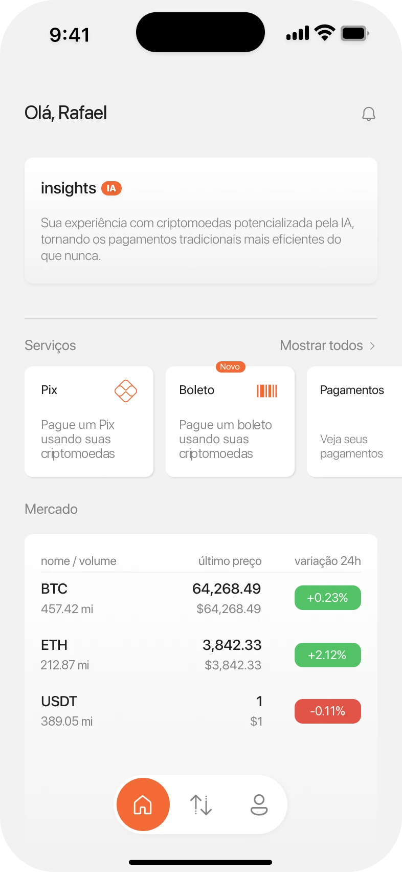
Home: greeting, an AI insights card, services for Pix, boleto and payments, a market list for BTC, ETH and USDT with 24-hour change, and the tab bar.

Home

The market at a glance, payments one tap away

  • AI insights read the market as it is right now, before any decision about what to spend.
  • Services put Pix, boleto and payments up front, the way a bank app would.
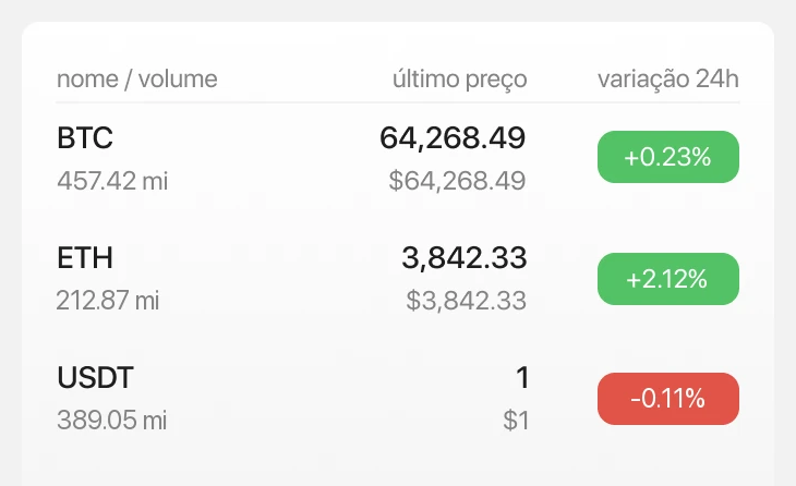
  • Market shows BTC, ETH and USDT with price, volume and 24-hour change: green up, red down.
  • Three tabs only, home, pay and profile, with the active one in orange.
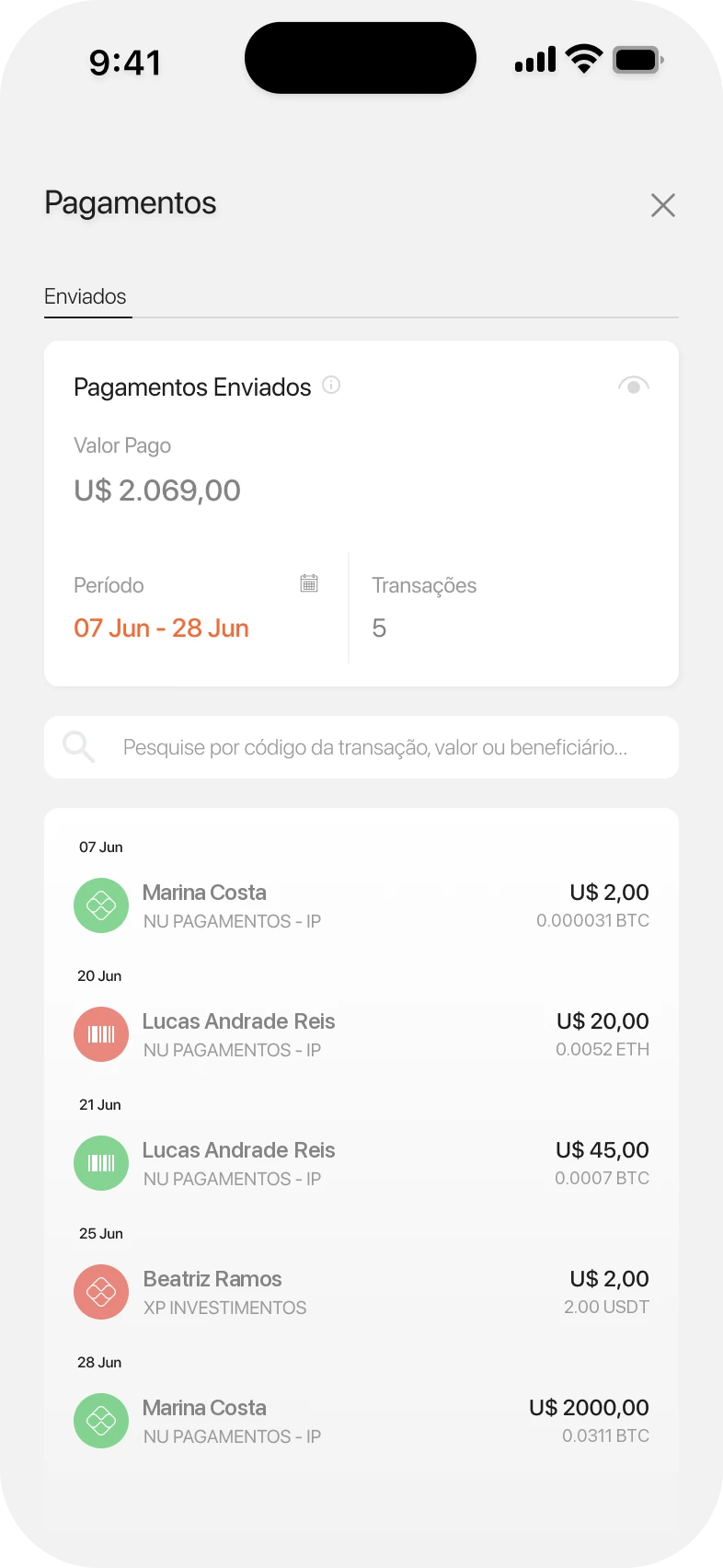
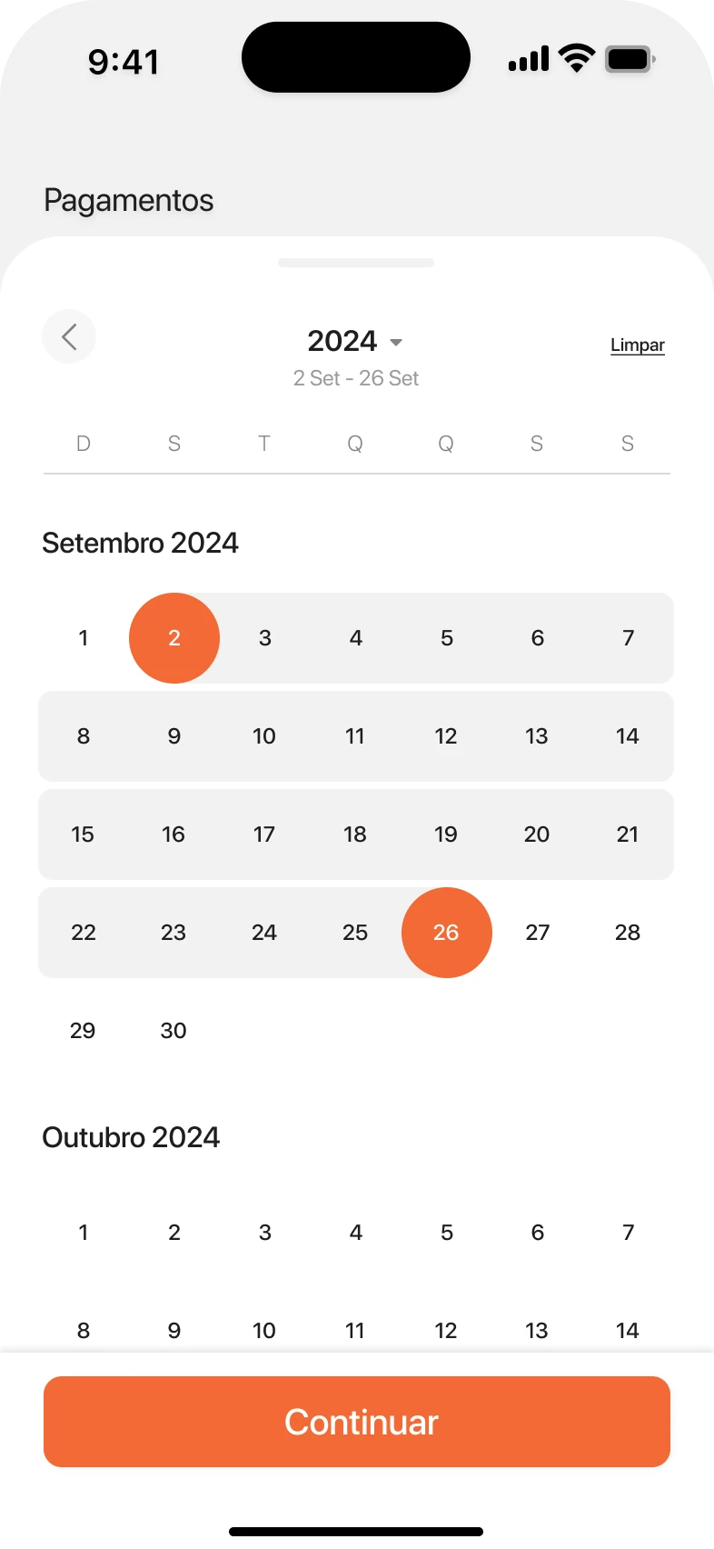
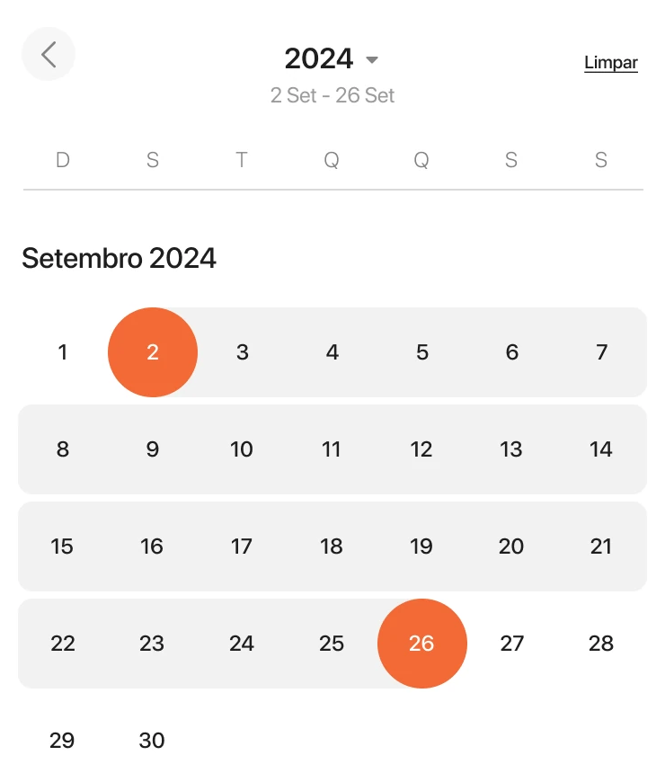
Payment history: total sent in the period, number of transactions, a search field and a list of payments by date. Date range picker: a monthly calendar with a start and end date selected in orange.

Payment history

Know where the money went

A running total for the period, the number of transactions and a search by name or code. The period opens a calendar for any range, with a year picker for going further back.

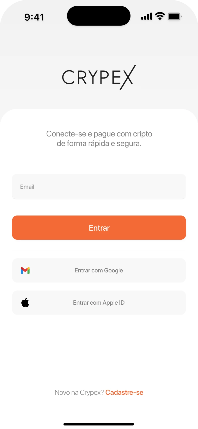
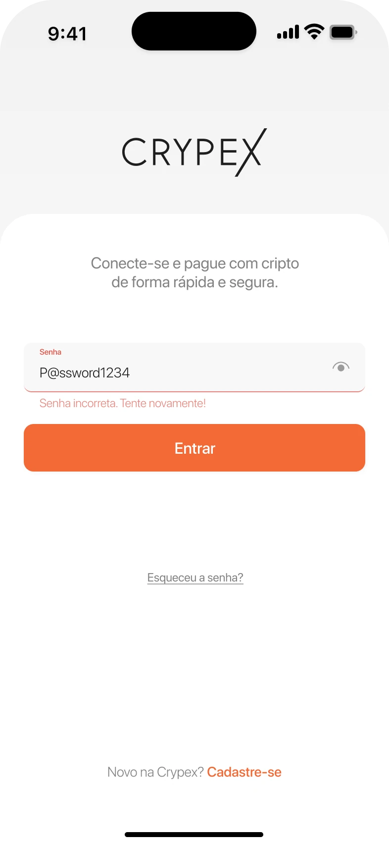
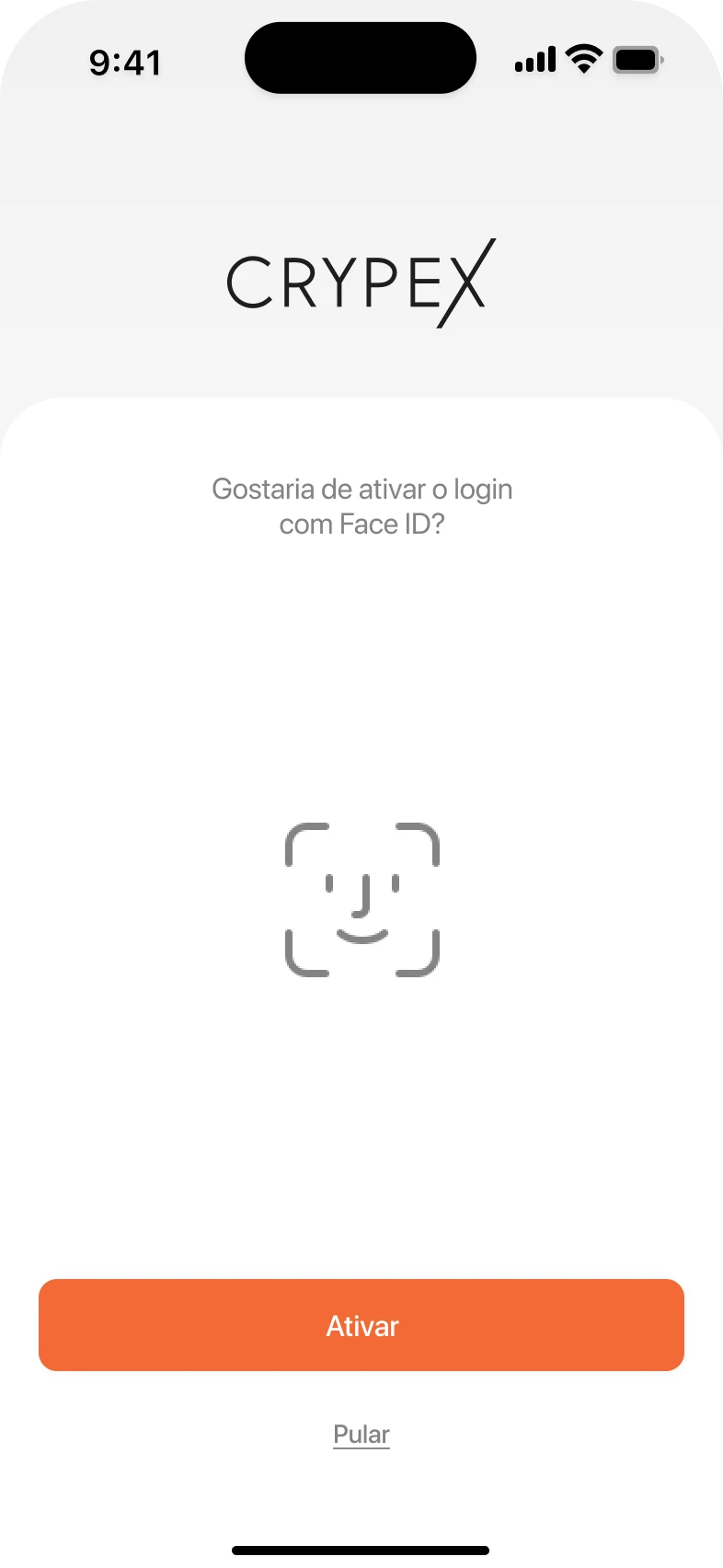
Sign-in: the Crypex logo, “Connect and pay with crypto, fast and safe”, an email field, and Google and Apple sign-in. Password step with an inline error under the field: incorrect password, try again. Prompt asking whether to turn on Face ID sign-in, with Turn on and Skip.

Sign-up and sign-in

Safe, without the ceremony

  • Email, Google or Apple, so nobody has to invent yet another password to get started.
  • Errors appear inline, right under the field that caused them.
  • Face ID is offered once, after sign-up or the first sign-in, and can be skipped. From then on, every return is one glance.
  • Password recovery in three short screens, with a countdown before the email can be resent.

Built around orange

Orange came with the brief. Rather than fight it, I built the whole system to make it earn its place. It's the colour people already link to Bitcoin, and it's warm in a market that usually dresses in cold black and blue.

To keep it from shouting, everything else stays calm: soft greys, white cards and near-black type. Orange is saved for what matters: the main button, the active tab and the one number worth checking twice, the total. Green and red appear only for results and market moves.

  • Action#F36935
  • Surface#F2F2F2
  • Card#FFFFFF
  • Text#1E1E1E
  • Up · success#52C265
  • Down · failure#E25448

One thing I'd change

White on this orange reaches 3.05:1. WCAG accepts that for large text, 14 pt bold or 18 pt regular, but not for a 16 pt regular label. So the fix is typographic, not chromatic: same orange, same white, with the label set at 19 pt bold. It passes, and the main action reads with more confidence.

As designed16 pt regular · 3.05:1Below AA
Proposed19 pt bold · 3.05:1Passes AA · large text

A small kit, built to hand off

Every screen is built from these parts.

Each state lives as a variant in Figma, so the build never depends on guesswork. The bell turns orange when there's something new, the tab bar has one state per tab, and the main action works both on the page and on a sheet. Service cards carry a badge for what's new or coming soon, so the roadmap shows up in the app itself.

Components 6 groups · 39 parts

Navigation

Top bar with “Olá, Rafael” and a grey bell.Top bar with “Olá, Rafael” and an orange bell for new notifications.Top bar with the title “Pagamentos” and a close button.Top bar with the title “Pagamentos” only.
Top barGreeting · new notification · title and close · title
Tab bar with Home active.Tab bar with Pay active.Tab bar with Profile active.
Tab barHome · pay · profile
Back button, a step title and three progress dots with the second one active.
Step headerBack, title and progress

Actions

Full-width orange Continue button.Grey button with the Gmail logo: Entrar com Google.Grey button with the Apple logo: Entrar com Apple ID.
ButtonsPrimary · Google · Apple
Underlined grey link: Esqueceu a senha?“Novo na Crypex?” followed by an orange Cadastre-se link.
LinksText link · inline link
Numeric keypad with Limpar and an active orange Continuar.Limpar and Continuar in grey, before an amount is typed.
KeypadReady · actions off

Inputs

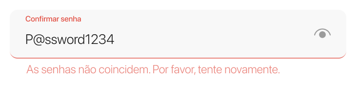
Empty text field with the placeholder Nome.Filled field: a small Email label above rafael.nogueira@email.com.Password field with a small Senha label and an eye icon.Field with a red label and underline and the message: passwords don’t match.
Text fieldEmpty · filled · password · error
Search field: search by transaction code, amount or recipient.
SearchCode, amount or recipient
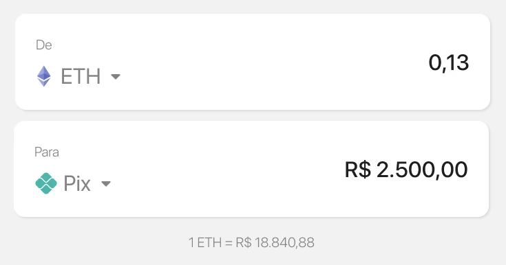
Two stacked cards, From ETH 0.13 and To Pix R$ 2,500.00, with the live rate below.
ConverterFrom, to and live rate

Cards and lists

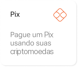
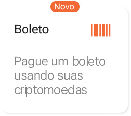
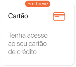
Service card: Pix.Service card: Boleto, with a “Novo” badge.Service card: Payments.Service card: Card, with an “Em breve” badge.
Service cardsPix · Boleto, new · Payments · Card, soon
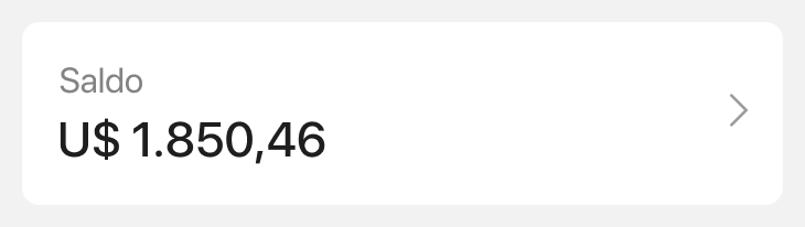
Card with Saldo, U$ 1,850.46 and a chevron.
BalanceAvailable to pay
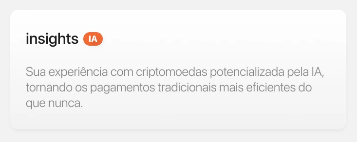
AI insights card with the IA badge.
InsightsAI, market right now
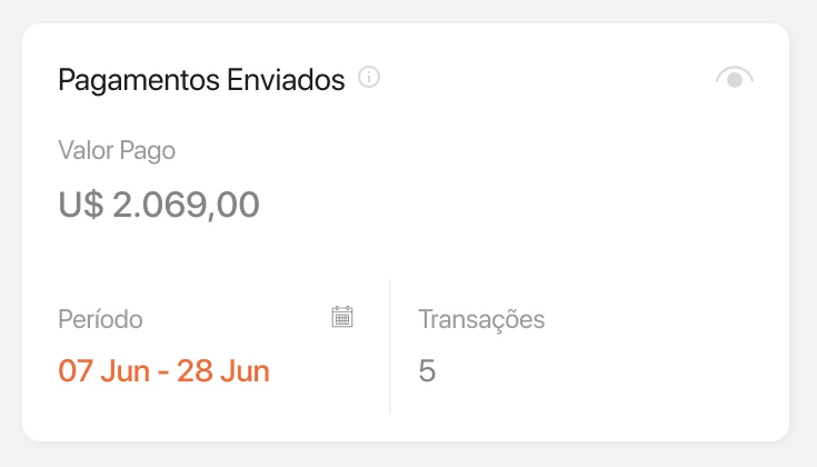
Card with total paid, the period in orange and the number of transactions.
Payments summaryTotal, period, count
Recipient card: name, masked CPF and bank.
RecipientName, CPF, bank
Light orange chip with a wallet address and a copy icon.
Wallet addressCopy to send
Market list: BTC, ETH and USDT with volume, last price and 24-hour change.
MarketPrice, volume, 24h change
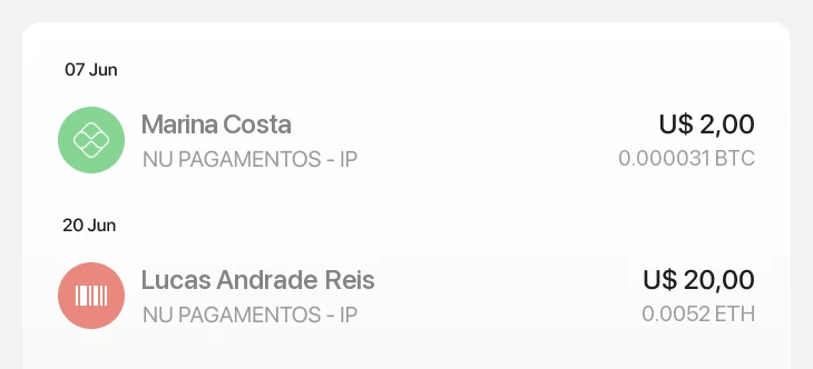
Two payments in the history list.
TransactionsGrouped by day
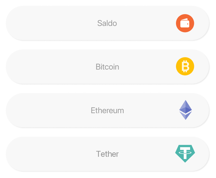
List of payment methods: balance, Bitcoin, Ethereum and Tether.
Payment methodBalance · Bitcoin · Ethereum · Tether

Pickers

Calendar for September 2024 with the 2nd and the 26th selected.
Date rangeStart and end in orange
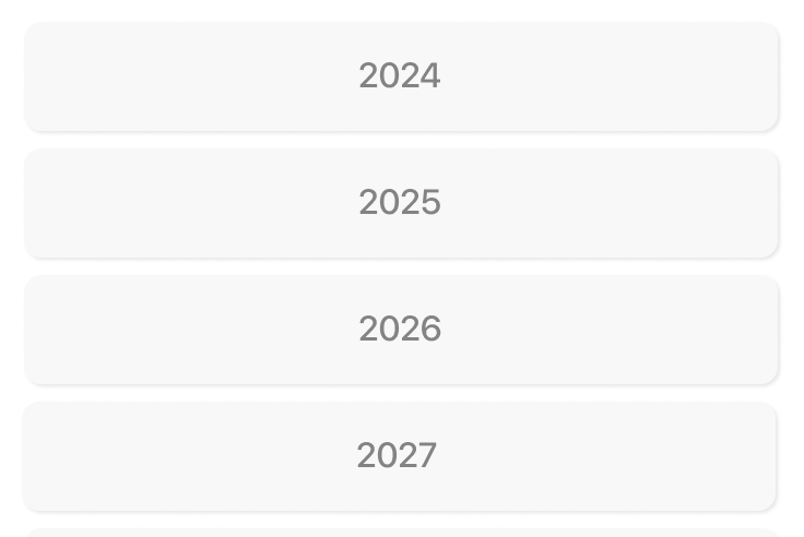
List of years to pick from, 2024 to 2027.
YearScrolling list

Feedback

Green check in a soft circle.Red cross in a soft circle.
StatusSuccess · failure
Three orange badges: IA, Novo and Em breve.
BadgesIA · Novo · Em breve
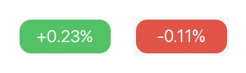
Green +0.23% and red -0.11% pills.
Market changeUp · down

A mark that crosses over

Logo, app icon and splash, all part of the file.

App icon App icon: a black X on a light grey tile.
Splash Splash screen with the Crypex wordmark centred on soft grey.
05

Outcome

Designed, tested, on hold

The founder wanted to see how the product would look and feel before committing to it, and the file answered that. It was handed off complete: sign-up and sign-in, home, the Pix flow with all of its states, payment history and a small component set, in sections marked ready for dev.

Launch was put on hold by Brazilian bureaucracy. At the time, the rules for crypto service providers were still being written: the Central Bank became the sector's regulator in 2023, and its authorisation rules only came out in November 2025. The project is paused, not dropped, and I'm still the founder's designer for when it picks up again.

When it picks up again

The next flows, boleto and card, go through the same five-person loop before they reach the file as final.

Shall we?

Working on something similar? Tell me about the product, the feature or the messy flow.