Jessica Monteiro case 01
All work

Case 01 · Moving marketplace · 2 apps · 2025

Moving day, from both ends

Muvr is a US marketplace for moves, deliveries and junk removal. Every job has two ends: the person who needs to move, and the driver who does the moving. Each end has its own app. Both had their flows, but they didn't work, so I recreated every one of them from scratch, as the only designer on the project.

UI/UXMobile AppMarketplaceRevamp
ClientMuvr · United States
RoleProduct designer, UX + UI, solo
Timeline2025 · freelance
ScopeUser app + Driver app
Cover Muvr User app + Driver app
Muvr

One move, two apps

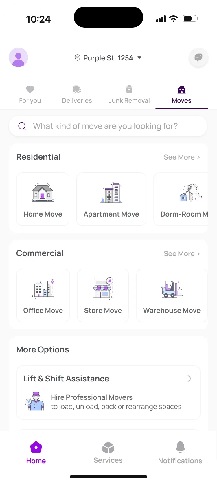
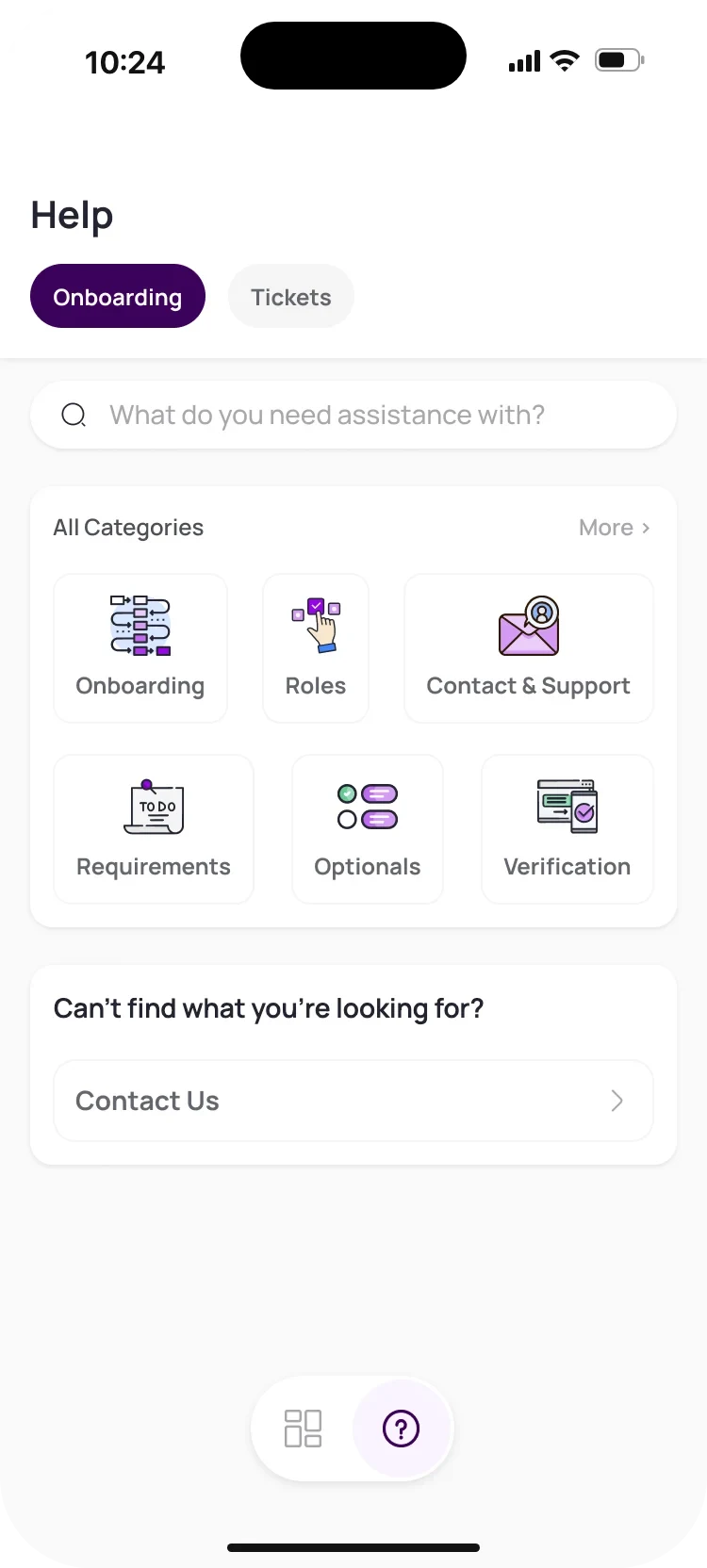
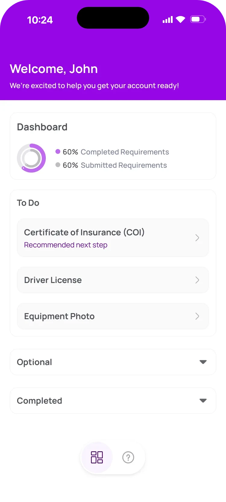
User app home: moves grouped as residential and commercial, each with its own illustration. Driver app help centre: onboarding and tickets tabs, search and six illustrated categories. Driver app onboarding dashboard at 60%, with one recommended next step.
01

Overview

Same move, two different jobs

A move looks like one event, but it's two very different experiences. For the person moving, it's a stressful day they want off their plate. For the driver, it's work: getting approved, taking the job, getting paid. So Muvr runs two apps, and each one had to be designed for its own person.

User app

For the person moving

Who
Families, students, offices, stores and warehouses
What they want
A fair price, the right truck and no surprises on the day
What got in the way
A booking that asked everything at once, and still missed what mattered
What I designed
Home, search, move types and booking for eight kinds of move
Driver app

For the service provider

Who
Movers, haulers and couriers, with their own truck or joining as helpers
What they want
To get approved quickly and start earning
What got in the way
Up to ten checks with no clear order, and declines with no explanation
What I designed
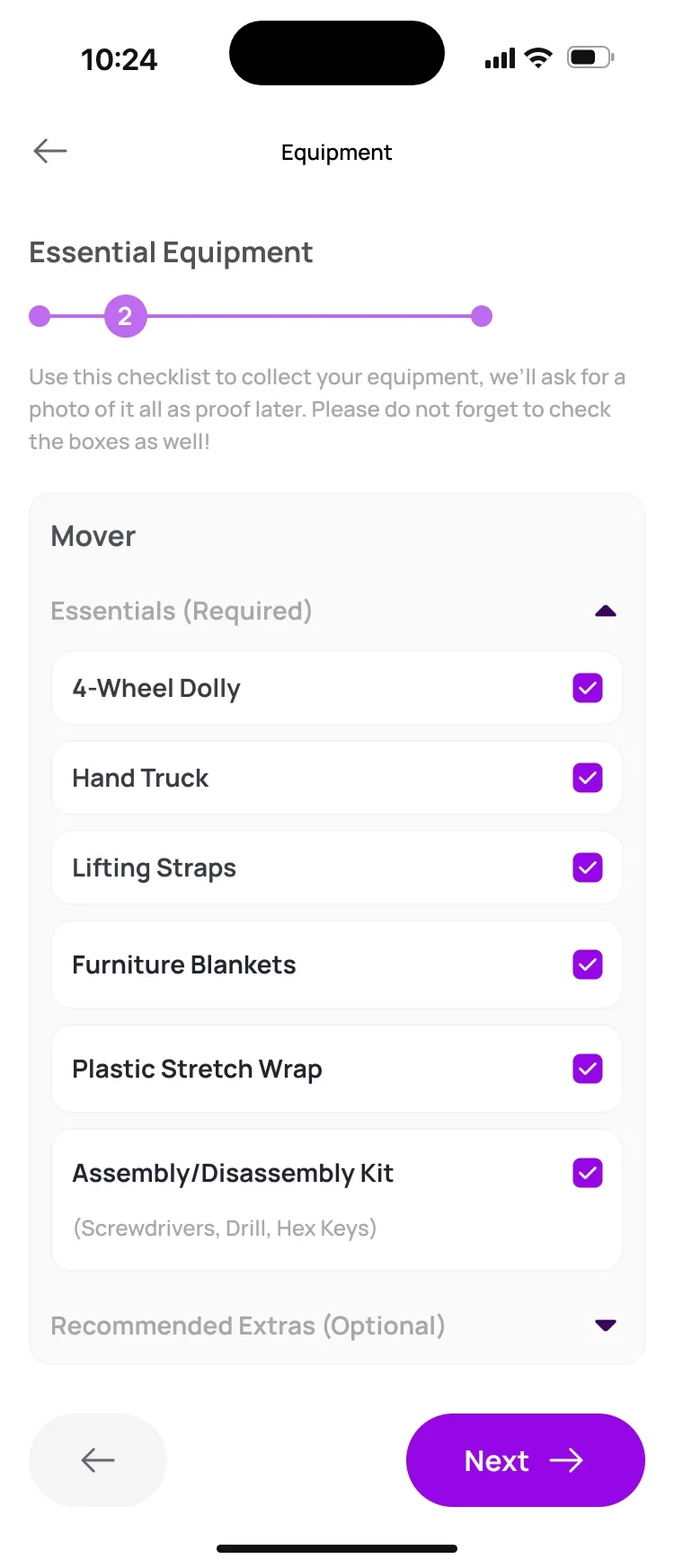
Sign-in, roles, an onboarding checklist, review states and help

My role

I was the only designer on the project, freelance, and I owned the work end to end. The old flows existed, but they didn't work, so none of them was carried over as it was: I audited the app, mapped every journey again, recreated each flow and its interface, built the components and documented everything for handoff.

Muvr's CEO is also a specialist in moving and logistics, so he took part in the reviews as the expert on the trade: truck sizes, how many movers a job needs, what really slows a move down. I brought the proposals, and he tested them against how moves happen in real life.

02

Process

Map it first, draw it second

With eight kinds of move and ten driver requirements, starting from screens would have meant drawing everything many times over. So every journey started on a FigJam board: each step, what it asks and what the system does with the answer. The boards were where decisions got made, before any pixel.
  1. 1

    Review

    The old flows, where each one broke, and the complaints users sent in.

  2. 2

    Map

    Every journey on FigJam, step by step, for each move type.

  3. 3

    Structure

    Find what repeats across the journeys, and what has to change.

  4. 4

    Design

    Screens, components and every state, one app at a time.

  5. 5

    Validate

    Walk the flows with the CEO, who knew the trade inside out.

The boards behind it

Redrawn from my FigJam files.

User appBooking journeyFigJam

Rules of the service

Service levels
  • Standard Loading, transport, unloading
  • Premium Adds disassembly and room placement
  • White-Glove Adds stretch-wrap, premium handling, cleanup
Schedule
  • Priority In 3 to 15 minutes
  • Express Within the hour
  • Same day After a 3-hour window
  • Next day Any time, or a set slot
Add-ons
  • Homes Packing supplies, junk removal, extra insurance
  • Businesses IT packing, equipment rental, extra insurance
On the day
  • Accepted by the movers
  • On the way, with an ETA
  • Arrived, loaded, at drop-off
  • Done, with proof

Nine steps, eight moves

01Pickup02Items03Drop-off04Level05Truck06Schedule07Review08Tracking09Proof
Home move
Apartment
Dorm room
Office
Store
Warehouse
Storage unit
Labor only
  • Designed
  • Specified
  • Not needed

Same steps, different questions.

Driver appHome and ordersFigJam

Context

The brief

Revamp home and orders for usability. Keep accepting and finishing a job effortless. Learn from Uber and Lyft.

Orders to support
  • Small item deliveries
  • Big item deliveries
  • Junk removal
  • Moves

Features to keep, flows redrawn

  • A control centre for drivers and helpers
  • Profile with reviews and ratings
  • Documents and account details
  • Earnings summary and payout
  • Order history, with “report an issue”
  • Rank, with new icons
  • Teams and favourites on one screen
  • Report a bug, inside help

Open questions

Photos at loading: every item in a move, or only the listed ones?

Pick a navigation app once, or every time?

On the way to pickup, include the route to the helper?

03

User app · for the person moving

Booking a move should feel like describing your home

The old booking asked for everything at once, and still missed what drives the price: a flight of stairs, a missing elevator, a gate code, a piano. I rebuilt it so people describe the move in their own terms, one small question at a time, and only when it applies to them.

Nine steps, from address to proof

Steps 1 to 3 designed for every move type.

Tell us about the move

  1. 01PickupAddress, access and time window
  2. 02Layout & itemsSize, rooms, special-care items
  3. 03Drop-offDestination, access, where things go

Choose how

  1. 04Service levelStandard, Premium or White-Glove
  2. 05Truck & moversSuggested from the size of the place
  3. 06SchedulePriority, express, same day or next day
  4. 07Review & paySummary, final notes, cards or wallets

On the day

  1. 08Live trackingMilestones, push and SMS
  2. 09ProofPhotos, rating and tip
  • Designed
  • Specified

Labor only skips the drive: one job location, the type of work, then straight to service level. Seven steps instead of nine.

Steps one to three, pickup, layout and items, and drop-off, are designed. Steps four to nine are specified.

Four decisions that shaped the booking

  1. The question

    Where should booking start? People open a move type to find out what it includes, not to fill in a form.

    The decision

    Right there. The first question sits above the service levels, so reading about a move is already step one.

  2. The question

    Eight kinds of move, eight different flows? That's eight times the screens, and eight ways to get lost.

    The decision

    One flow whose fields adapt: hall and room for a dorm, unit for an apartment, floor for an office, loading dock for a warehouse.

  3. The question

    What really changes the price? Access: stairs, elevators and opening hours, the things people forget to mention.

    The decision

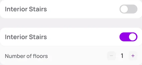
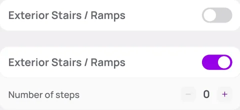
    Ask about access up front, each question behind a switch that only opens when it applies.

  4. The question

    How big a truck, and how many movers? Few customers can tell, and a wrong guess means a second trip.

    The decision

    Let the system suggest both from the size of the place, with a floor: four movers above 1,500 sq ft. People can size up, never down.

Home and search

The right move in one tap, or one word

  • Moves, deliveries and junk removal share one home, one tab each.
  • Moves are grouped the way people think of them, each with its own illustration.
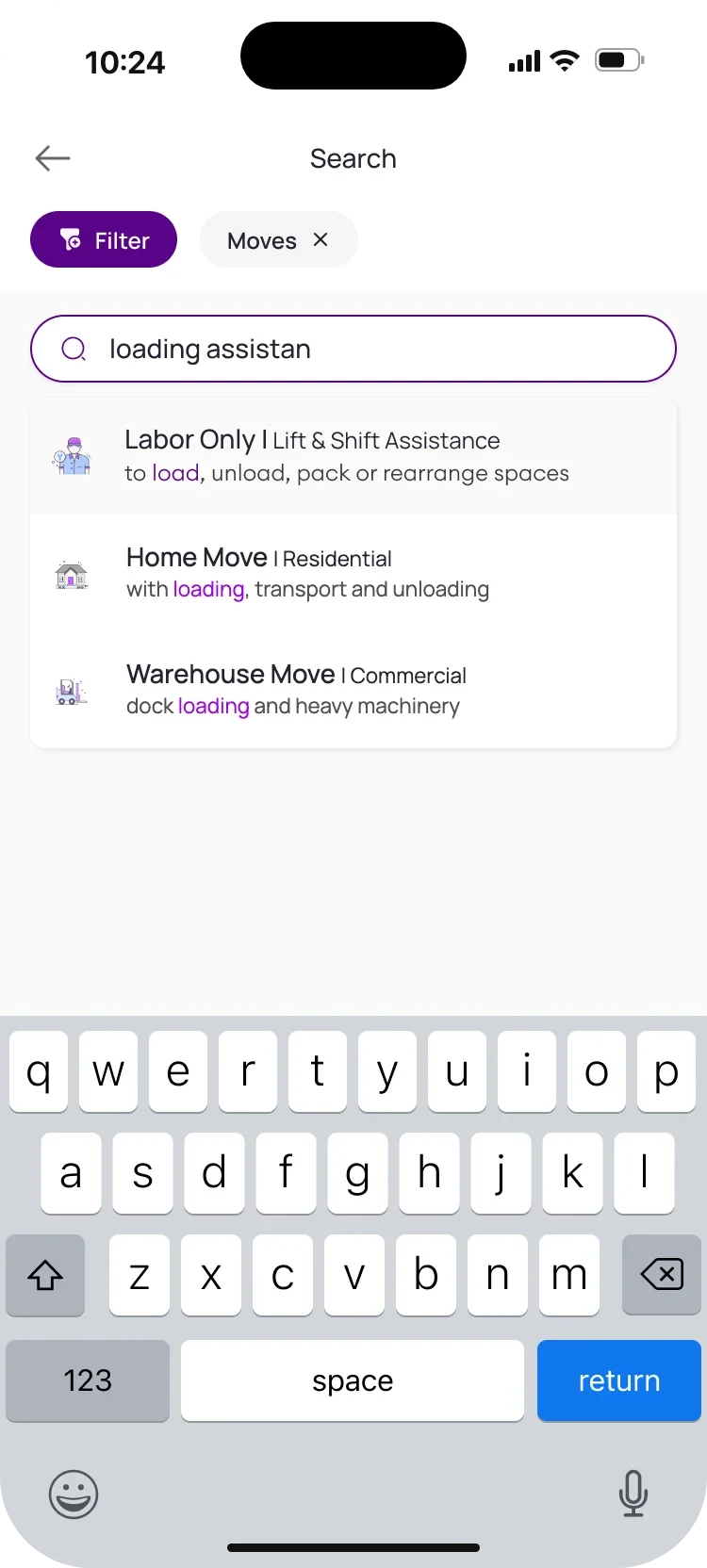
  • Search understands the need, not just the name: “loading assistance” finds Labor Only.
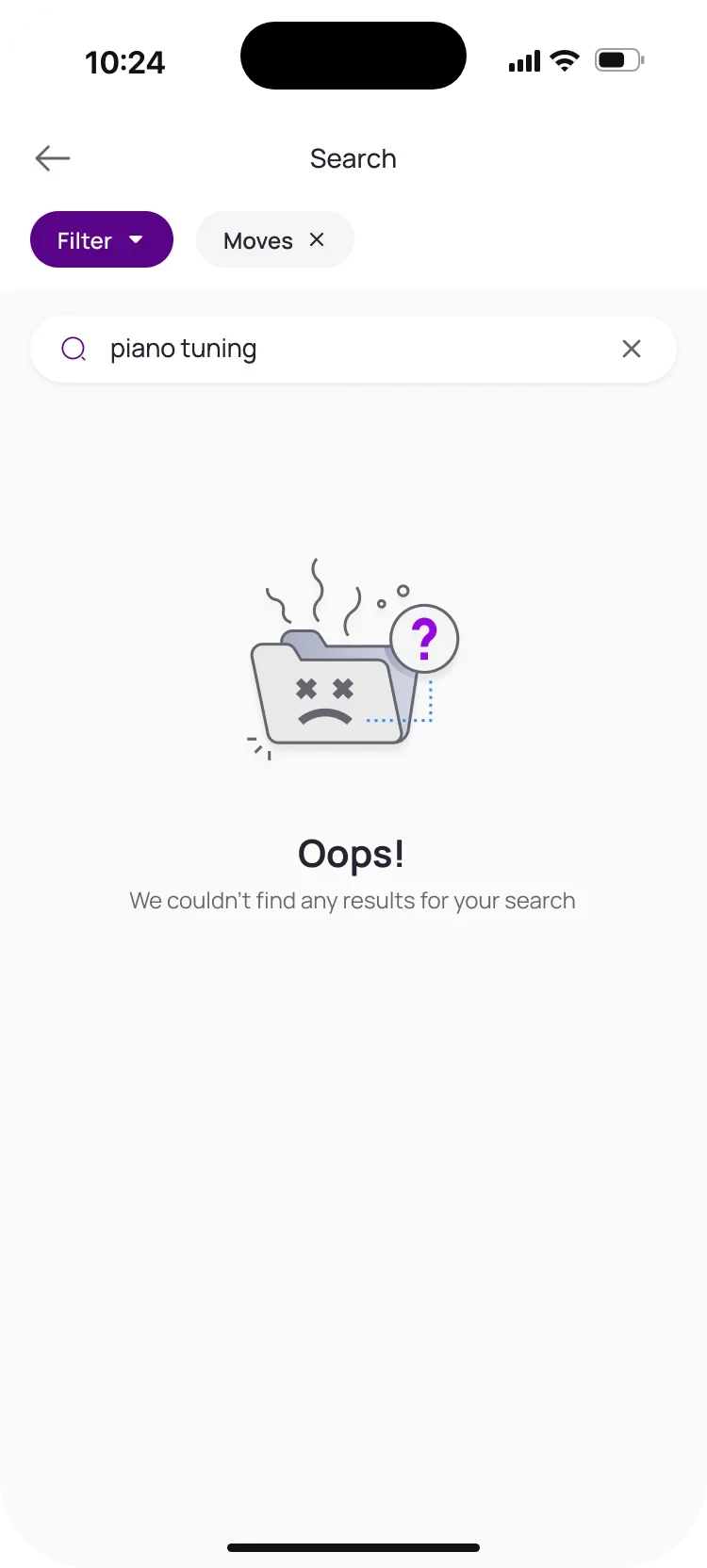
  • When nothing matches, the empty state says so kindly, with a way back.
Home on the Moves tab: a search field, residential moves (home, apartment, dorm room), commercial moves (office, store, warehouse) and Lift and Shift assistance under more options. Search with “loading assistan” typed: the first result is Labor Only, Lift and Shift Assistance, with the matching word highlighted. Search with no results: a sad folder illustration, “Oops!” and a short line saying nothing matched.
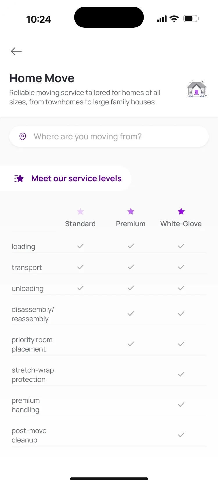
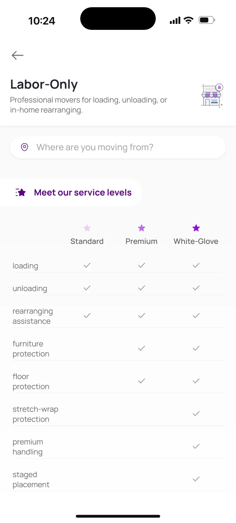
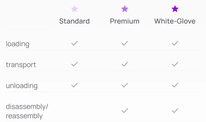
Home Move: a one-line description, “Where are you moving from?” and a table comparing Standard, Premium and White-Glove. Labor-Only page: rows for rearranging, furniture and floor protection and staged placement.

Move types

A page for every kind of move
  • Each move type explains itself in one line, next to its own illustration.
  • Three levels, side by side. Ticks show exactly what Premium and White-Glove add.
  • The rows change with the move: labor only talks about floor protection, not transport.
  • The first question sits on top, so booking starts without leaving the page.
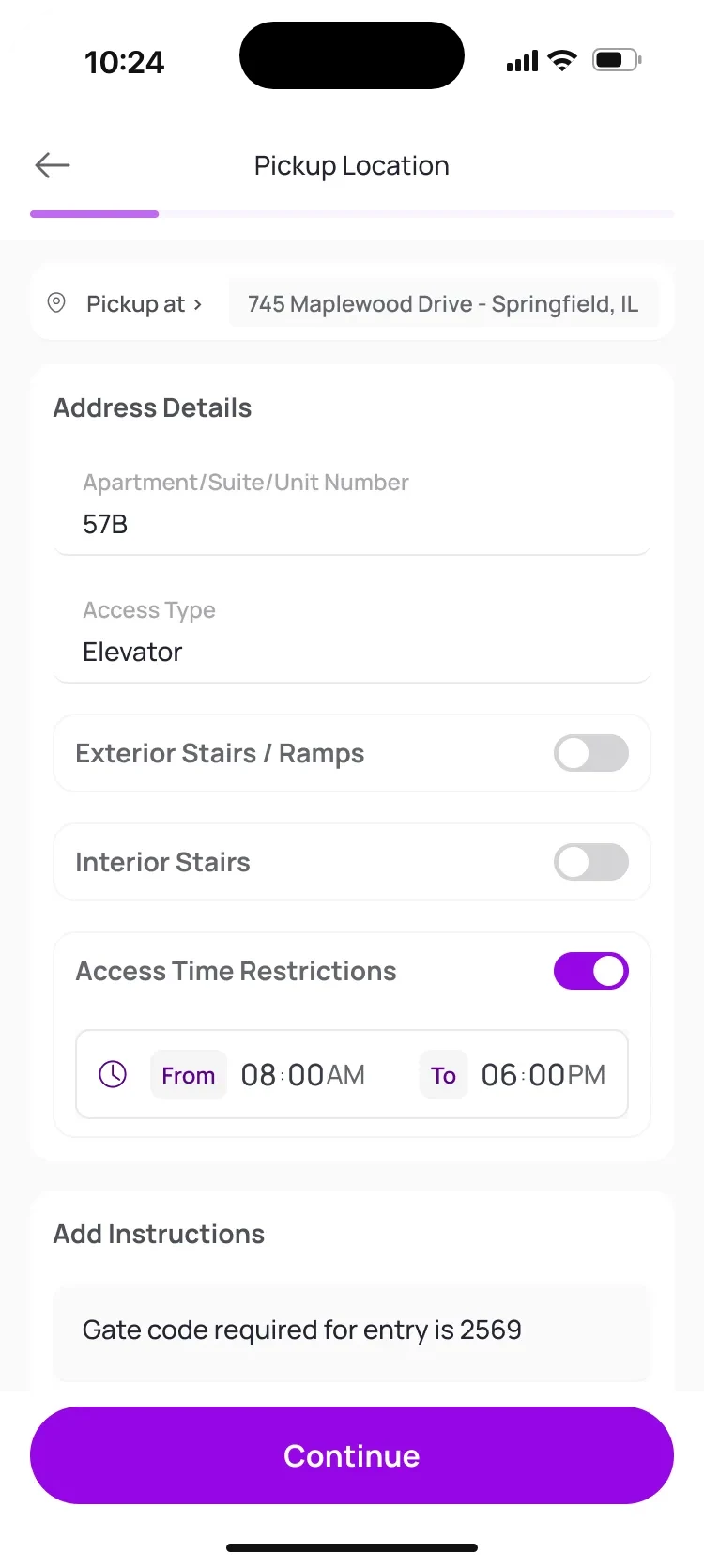
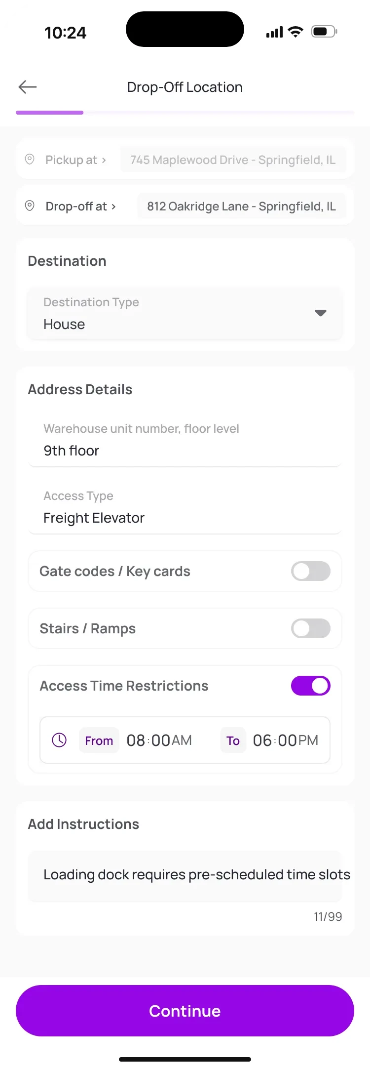
Pickup details for an apartment: unit number 57B, access by elevator and a time window from 8 am to 6 pm. Drop-off details for a warehouse: both addresses on top, 9th floor by freight elevator, access hours from 8 am to 6 pm and a note about pre-scheduled loading dock slots.

Booking · steps 1 and 3

One form that knows the building

  • Pickup and drop-off share one form, and its fields change with the place: unit, hall and room, floor, loading dock.
  • Access only when it applies. Turn a switch on and its counter or time picker appears.
  • A short note carries what no field can, like a gate code or where the sofa goes.
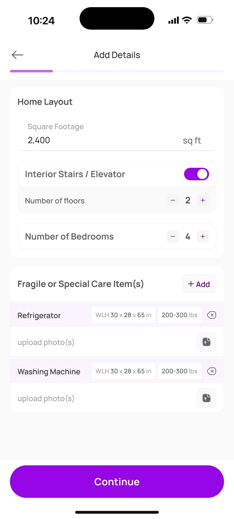
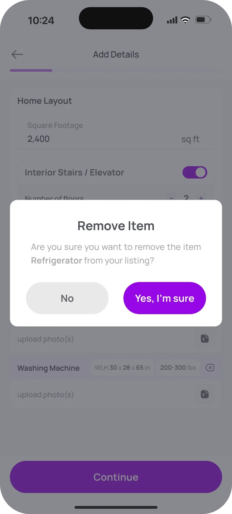
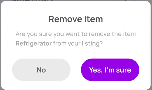
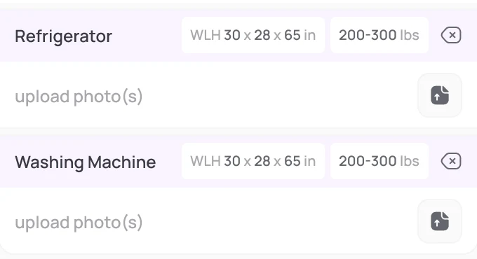
Home layout with two floors and four bedrooms, and two items listed, a refrigerator and a washing machine, each with its size and a 200 to 300 lbs weight range. A dialog over the list: Remove Item. Are you sure you want to remove the refrigerator from your listing? No, and Yes, I’m sure.

Booking · step 2

Say what's heavy before anyone lifts it

  • First the size of the place: the numbers that choose the truck.
  • Each item carries what the driver needs: dimensions, a weight range and photos.
  • Removing one asks first, so nothing disappears by accident.
04

Driver app · for the service provider

Getting approved should feel like a checklist, not a maze

Before the first job, a driver has a lot to prove: identity, licence, vehicle, insurance, a background check, even how they lift and wrap furniture. The old app threw it all at once. I turned it into a guided path, with one clear next step and an answer for every submission.

Three decisions that shaped onboarding

  1. The question

    How should drivers sign in? They're often on the move, and passwords get forgotten.

    The decision

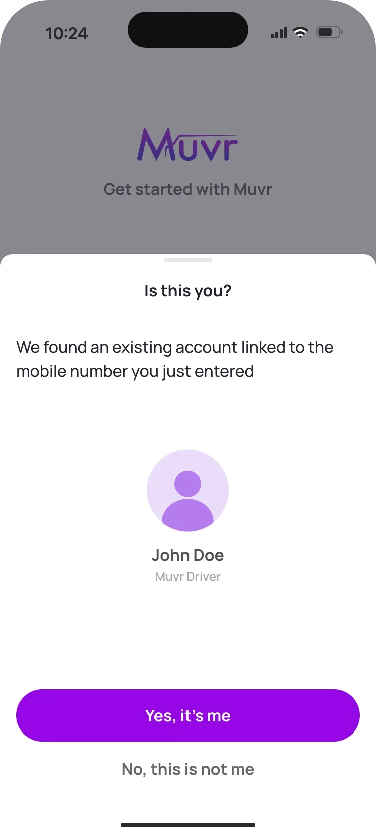
    With the phone. One number and a six-digit code, and if the number already has an account, the app asks “Is this you?” before creating another.

  2. The question

    Up to ten requirements before the first job. Where do you start?

    The decision

    A dashboard that always recommends one next step, and folds away what's done. Couriers get a shorter list.

  3. The question

    What happens after you submit a document, and how do you know?

    The decision

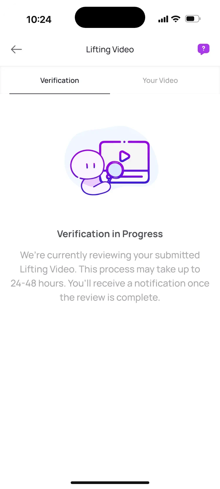
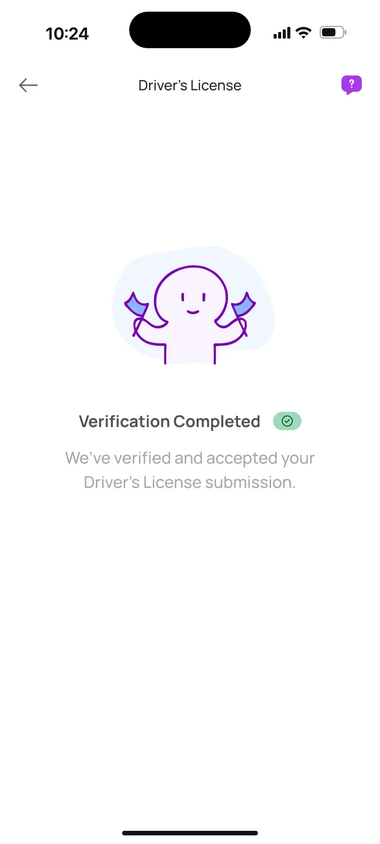
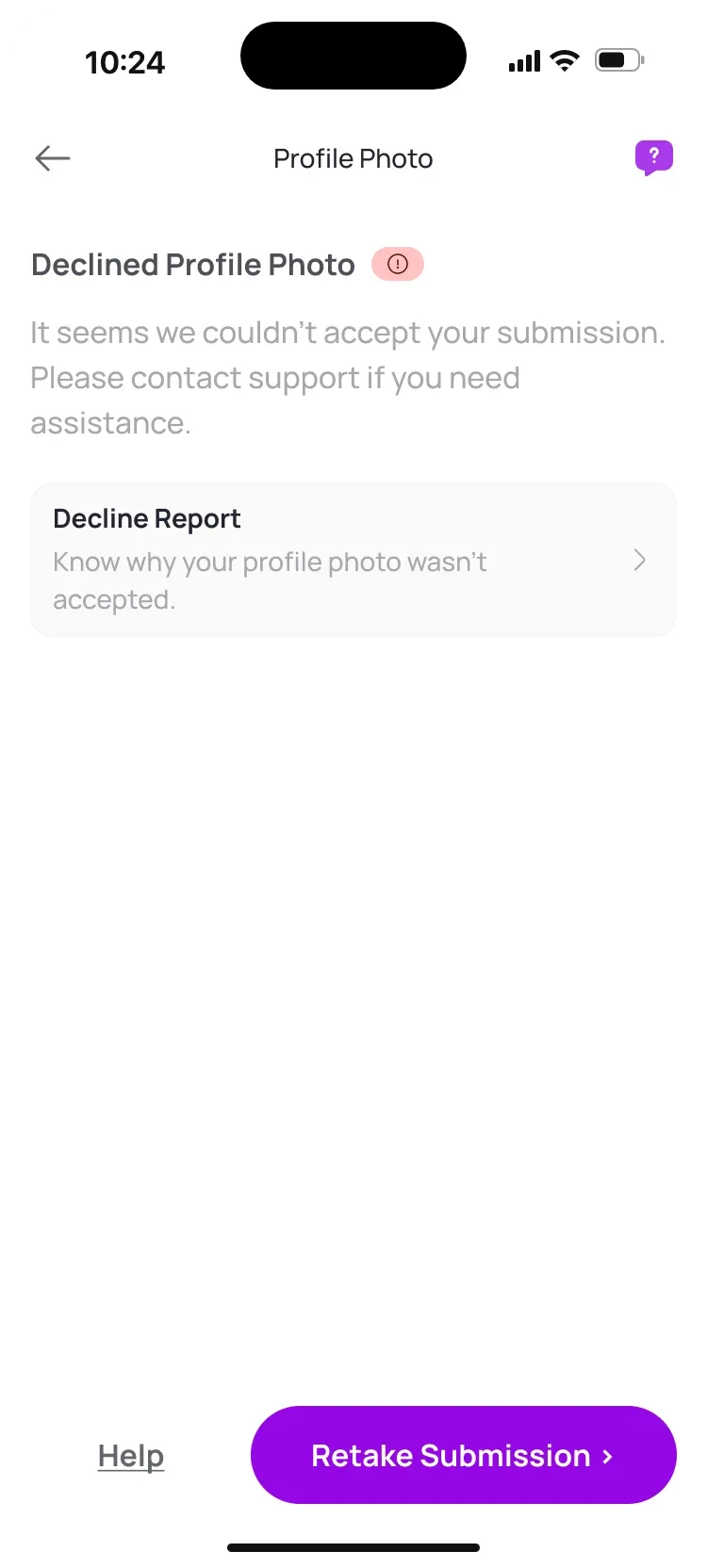
    Every review has a visible state: in review, accepted or declined. A decline always comes with a report and a retake.

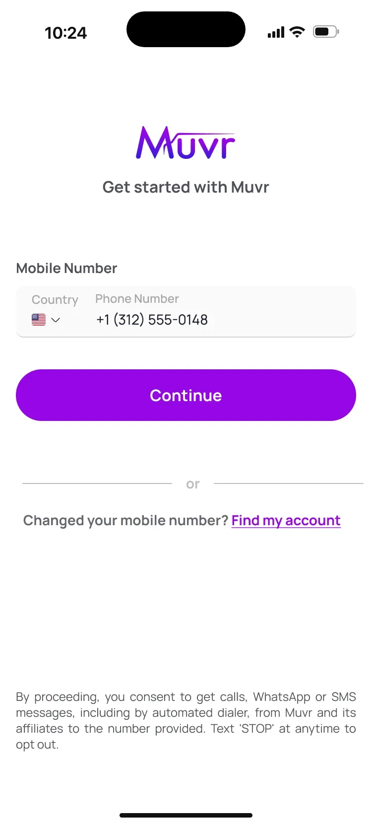
Get started with Muvr: a mobile number field with a country picker, Continue, and a Find my account link for people who changed their number. “Is this you?” sheet: an existing account was found for that number, with the driver’s name, a Yes, it’s me button and No, this is not me.

Sign-in and sign-up

A phone number is all it takes to start

  • One field to begin: the mobile number, with the country set by a flag.
  • “Is this you?” An existing account shows up before a second one gets created.
  • A six-digit code, then name, verified email, city and the terms.
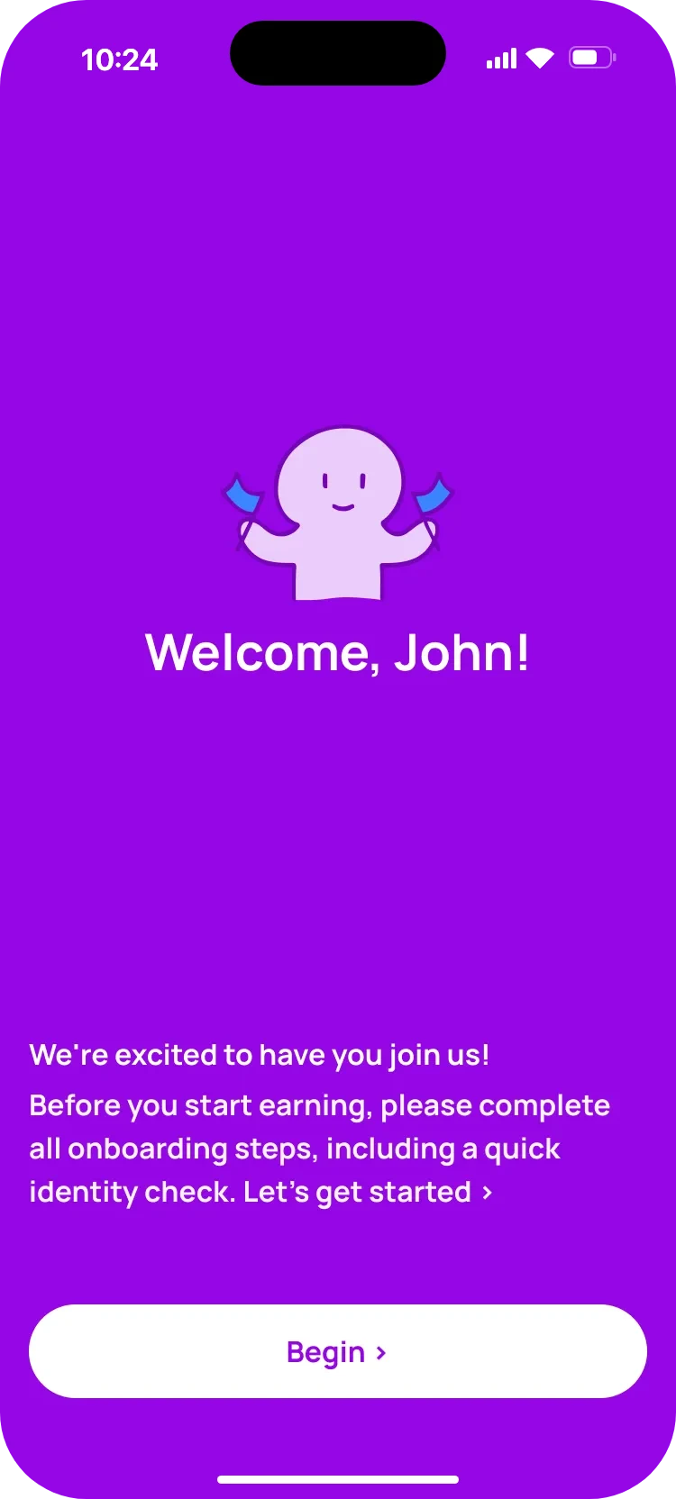
Welcome, John: a friendly character with flags, a short note about completing onboarding and an identity check, and a Begin button. Role selection: Mover, Hauler and Courier, with the Mover card expanded to explain what a mover does, the requirements, and driver versus helper.

Roles

Know what a role asks before you pick it

  • A warm welcome that says what's ahead, identity check included.
  • Every role explains itself: the work, the requirements, and driver versus helper.
  • No truck? The mover card says so right away: you can still join as a helper.
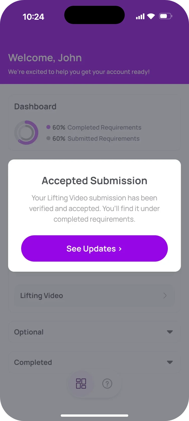
Onboarding dashboard at 60%: three items left, the certificate of insurance recommended next, and optional and completed sections folded away. Dashboard with a pop-up: Accepted Submission. Your Lifting Video submission has been verified and accepted, with See Updates.

Onboarding dashboard

Ten requirements, always one next step

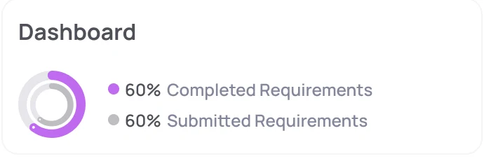
  • The ring shows two numbers that aren't the same: submitted and approved.
  • One recommended next step, so nobody has to decide where to begin.
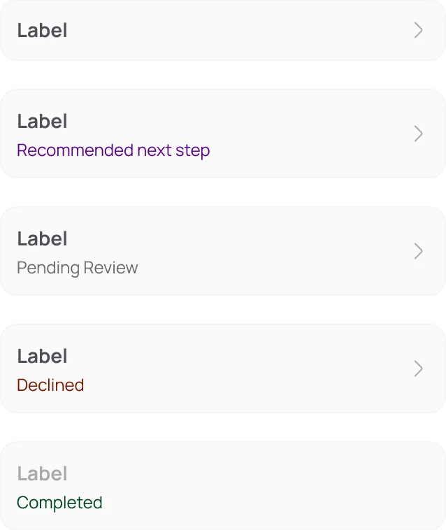
  • Every card says where it stands, and done or optional items fold away.

Requirements

Each requirement shaped around its proof

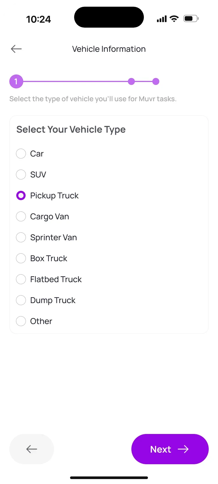
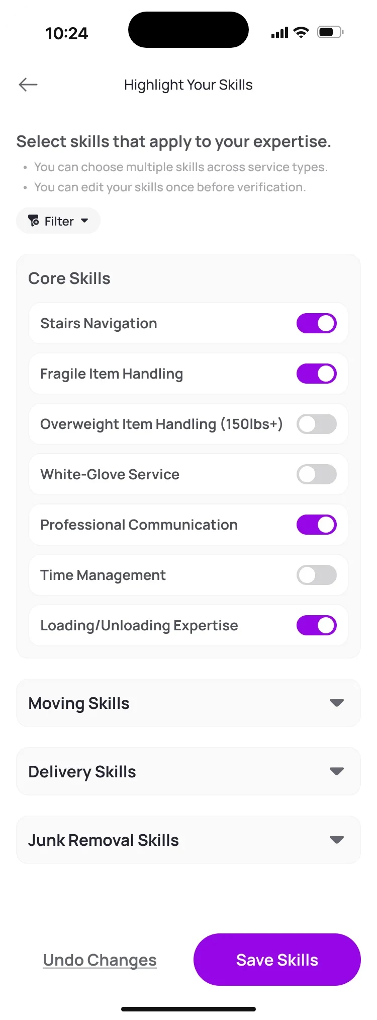
A vehicle is a short form, safety gear is a checklist and skills are switches. Each requirement asks in the way that fits what it proves, with the same header, progress and buttons around it.

After you submit

Every submission gets an answer

The same moments repeat across the eight requirements that need a review, so drivers learn the pattern once. Waiting has a shape, good news gets a small celebration and a decline is never a dead end.

Help centre

Help that knows where you're stuck

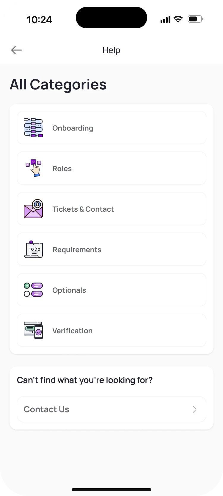
  • Categories follow onboarding itself: roles, requirements, optionals, verification.
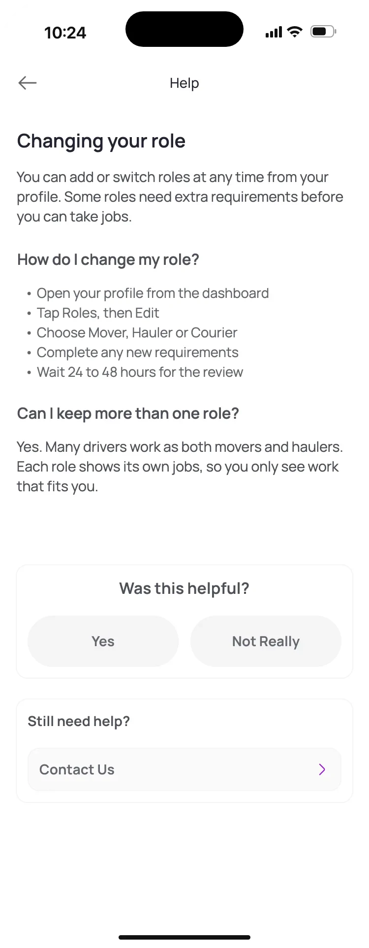
  • Articles answer one question each, and ask “Was this helpful?” at the end.
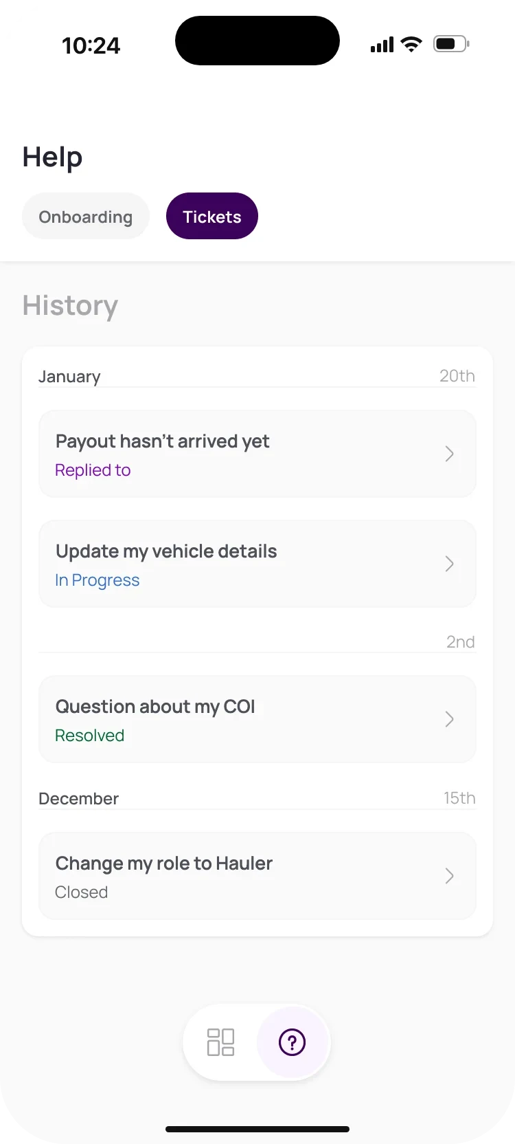
  • When they don't help, a ticket is one tap away, and its status is easy to follow.

Next up: orders, the way drivers already know them

From the Home & Orders board.

The last piece I mapped was the driver's home: accepting and completing jobs. Ride-hailing apps have already taught drivers how that should feel, so the order card borrows their rhythm and changes as the job gets closer.

Order card 4 states
Four versions of an order card for a $35.50 store delivery, 7 miles away. Tomorrow and Today show View Order Details, with Navigate greyed out today. Now turns the time purple and enables Navigate. The last one is a status stepper: order accepted, en route to pickup, “Have you arrived?” and Update Status.
  1. TomorrowDate, time, pay and distance, in one line.
  2. TodayNavigate appears, still asleep.
  3. NowThe time turns purple and Navigate wakes up.
  4. On the wayThe card becomes a stepper: one question, one button.
05

Design system

Two apps, one family

Both apps are built from the same small set of parts, each one drawn with all of its states. A switch in the booking flow behaves like a switch in onboarding, and developers never have to guess what happens next.

Components 6 groups · shared by both apps

Navigation

Where you are, and how to get back.

Top tabs: For you, Deliveries, Junk Removal and Moves, with Moves active.
Service tabsUser app · four services
Step header: back arrow, Pickup Location and a progress bar.
Step headerBack · title · progress
Tab bar: Home active, Services and Notifications.
Tab barUser app
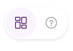
Floating menu with the dashboard active and help.
Floating menuDriver app · dashboard and help

Inputs

Asking only what's needed, and showing it back.

Search field: What kind of move are you looking for?
SearchPlaceholder as a question
Filled text field: Apartment, Suite or Unit Number, 57B.
Text fieldLabel stays when filled
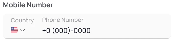
Mobile number field with a US flag country picker.
PhoneCountry · number
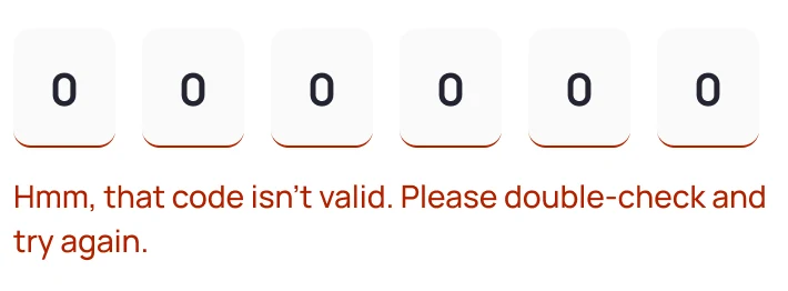
Six-digit code input in its error state, with a friendly message.
CodeSix digits · error
Interior Stairs switch, off, then on with a Number of floors counter.Exterior Stairs or Ramps switch, off, then on with a Number of steps counter.
Access switchOff · on, with its counter
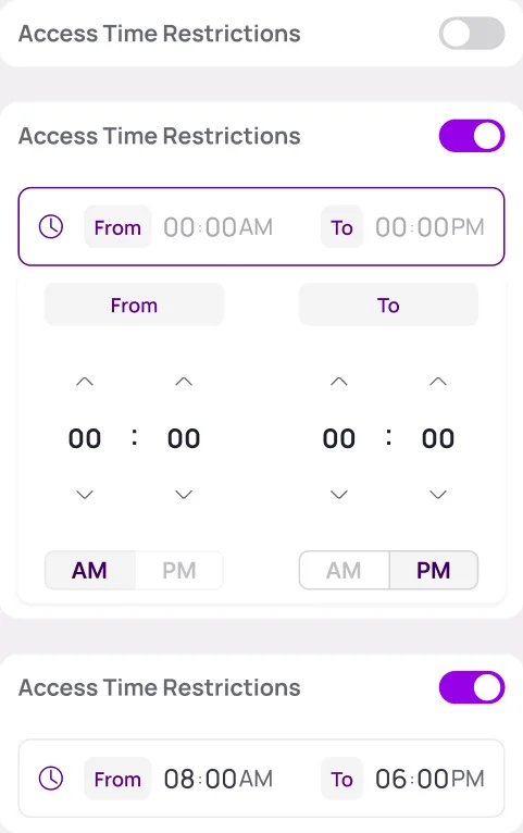
Access Time Restrictions: off, on with the picker open, and on with 8:00 AM to 6:00 PM set.
Time windowOff · picking · set

Selection

Choices you can see all at once.

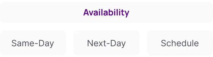
Filter chips under Availability: Same-Day, Next-Day and Schedule.
Filter chipsAvailability · service
Room type: Single Dorm, Shared Dorm selected, Suite.Assistance format: Per Hour selected, Per Item.
SegmentedRoom type · per hour or item
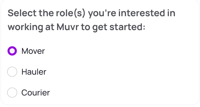
Radio list for roles: Mover selected, Hauler, Courier.
Radio listPick a role
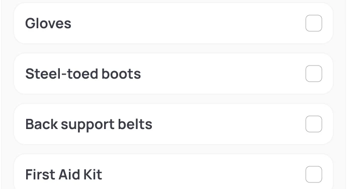
Checklist of safety gear: gloves, steel-toed boots, back support belts, first aid kit.
ChecklistSafety gear

Feedback

Every action gets an answer.

Progress card: 60% completed and 60% submitted requirements, with a ring.
ProgressSubmitted · approved
Requirement card in five states: plain, recommended next step, pending review, declined and completed.
Requirement cardNext · pending · declined · done
Verification Completed with a green check badge.Declined Profile Photo with a red alert badge.
Status titleAccepted · declined
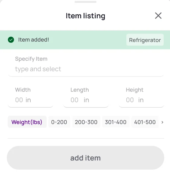
Item sheet after adding: a green Item added! banner and empty fields for the next item.
Inline confirmationItem added, ready for the next
Dialog: Remove Item. Are you sure you want to remove the refrigerator? No, and Yes, I'm sure.
Confirm dialogBefore anything is lost

Actions

One main action per screen.

Primary button, Continue, enabled in purple.Primary button, Continue, disabled in grey.
PrimaryReady · not yet
Back and Next buttons for multi-step flows.
Back and nextMulti-step flows

Cards

Content people scan, compare and open.

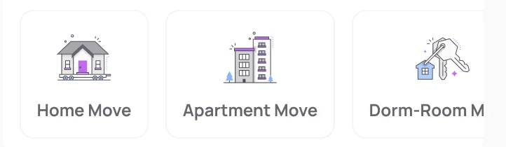
Move type tiles: Home Move, Apartment Move and Dorm-Room Move, each with an illustration.
Move typeIllustration · name
Service level table: Standard, Premium and White-Glove, with ticks for loading, transport, unloading and disassembly.
Service levelsCompare at a glance
Item rows: refrigerator and washing machine, each with dimensions, weight range, remove and upload photos.
Item rowSize · weight · photos
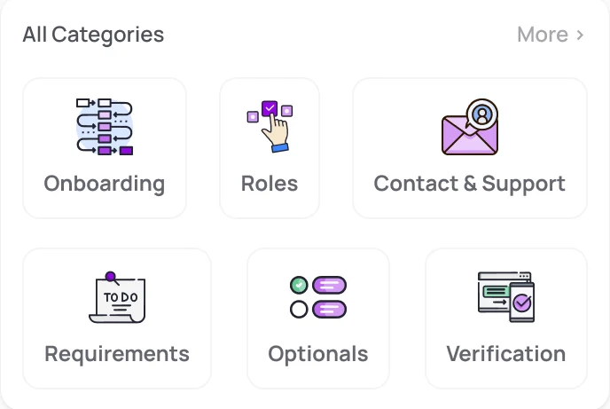
Help categories: onboarding, roles, contact and support, requirements, optionals and verification.
Help categoriesIllustrated shortcuts
Ticket card with the status Replied to.
TicketTitle · status

Illustrations with a Muvr accent

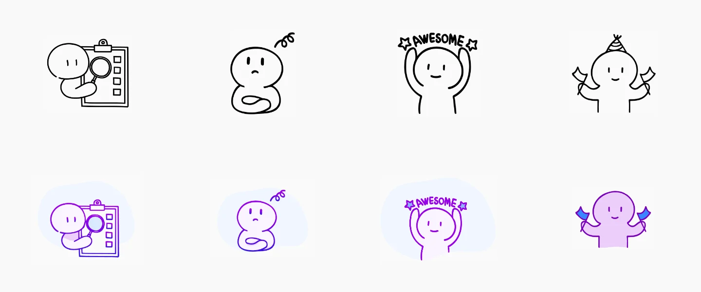
The characters started as plain black line drawings. I adapted them to the brand: purple strokes, a soft lilac fill and a pale backdrop, and gave each one a job: reviewing, waiting, something's wrong, done.

Four line illustrations in black, and below them the same characters in Muvr purple with a soft lilac fill: checking a list, puzzled, cheering “Awesome” and waving flags.

One purple, used with care

Purple is Muvr's colour, and the revamp kept it, but gave it a job. The bright purple marks what moves you forward: the main button, a switch that's on, progress. A deeper purple marks what you've chosen.

Everything else steps back: white cards with soft corners, dark text and grey for hints, so the purple always means something.

  • Action#9506E6
  • Selected#59048A
  • Card#FFFFFF
  • Text#232430
  • Secondary#4F5059
  • Hint#A7A7AC

One thing I'd change

The light grey used for hints and longer explanations reaches only 2.40:1 on white. Fine for a placeholder, not for text people must read, like why a document was declined. A darker grey, #6E6E76, keeps the same quiet tone and reaches 5.05:1.

As designed#A7A7AC · 2.40:1Below AA
Proposed#6E6E76 · 5.05:1Passes AA

And one more

Before paying for the background check, the app shows the driver's full Social Security number to confirm it. The last four digits are enough to confirm, and nobody looking over a shoulder gets the whole number.

As designedFull number on screenExposed
ProposedLast four digits onlyPrivate
06

Outcome

Handed over with the whole map drawn

The feedback on the work was good. When I handed over, both apps had their core flows designed, with components and states, and the booking journey was mapped end to end for every move type.
The next phase called for a different kind of engagement, a full-time, day-to-day role inside the team. For that particular setup, the terms and the scope didn't match, so we agreed to close my part at that milestone, on good terms, with everything documented for the team to build on.

What I'd measure next

  • User Booking completion, by move type

  • User Where people drop off, step by step
  • Driver Days from sign-up to first job
  • Driver Declined submissions that get retaken

If I picked it up again

The booking would go in front of real customers, and onboarding in front of real drivers, before anything new gets drawn.

Muvr's name and brand belong to Muvr. Photos in the screens were swapped for neutral avatars in this case study.

Shall we?

Working on something similar? Tell me about the product, the feature or the messy flow.